

The US Added Only 57,000 Jobs in June. Unemployment ‘Fell’ to 4.2%. The Honest Number Is 5.3%.
The June 2026 jobs report was weak on almost every line that measures hiring, and the unemployment rate dropped to 4.2% anyway. Hold the labor force at last year’s share and the same month reads 5.3%

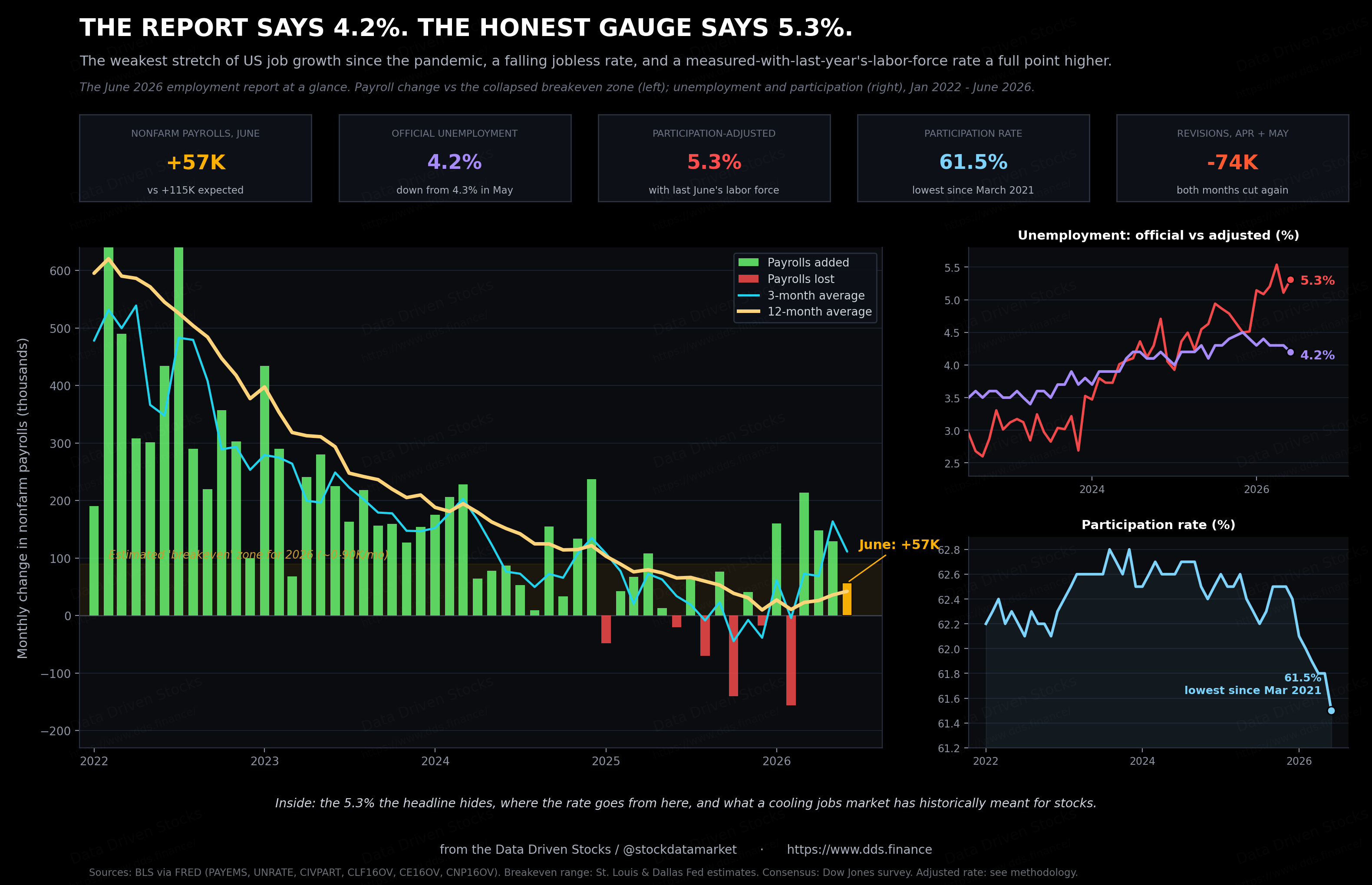
Wherever you are, the number that moved markets on Thursday was small: the US economy added 57,000 jobs in June, less than half of what Wall Street penciled in, and one of the weakest prints in over a year. All may be because 2026 FIFA World Cup boost did end

Before you start - this article won’t fit in your e-mail inbox - go to dds.finance for more:

Then came the part that confused people. The unemployment rate did not rise. It fell, from 4.3% to 4.2%. Average hourly earnings held firm at 3.5% over the year. A market braced for a soft report got a soft report, and the jobless rate improved anyway.
If that sounds contradictory, it is worth sitting with, because the explanation is the single most important thing to understand about the US economy right now. Hiring has slowed to a trickle. The unemployment rate is staying low for a reason that has almost nothing to do with strength, and later in this piece that reason gets a number: measured with last year’s labor force, June’s rate is 5.3%, not 4.2%.
The report card
Start with the print itself. Nonfarm payrolls came in at 57,000 against a Dow Jones consensus of about 115,000. Private employers added just 49,000, government added 8,000, and manufacturing added 3,000, which rounds to nothing. Leisure and hospitality lost 61,000 jobs, which the Bureau of Labor Statistics put down to weaker-than-usual summer hiring, with some of the seasonal math likely scrambled by the World Cup being played across the US, Canada and Mexico this summer.
The revisions were the quiet damage. April was cut by 31,000 and May by 43,000, so the two months together came in 74,000 lower than first reported. The pace of hiring over the prior twelve months now averages just 36,000 a month by the BLS’s own reckoning. A year ago that kind of number would have been read as the economy stalling.
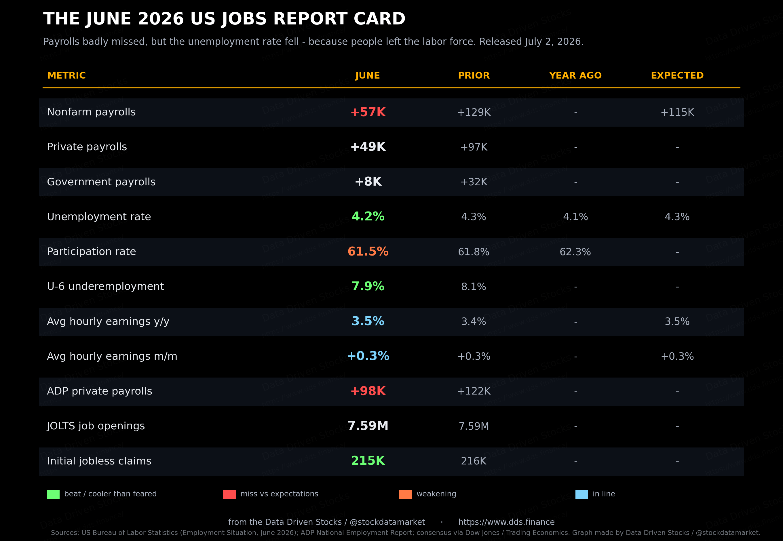
ADP’s private-payroll count, out a day earlier, told the same story from a different dataset: 98,000 jobs, below the 122,000 in May and short of forecasts. The firm’s chief economist, Nela Richardson, tied the slowdown to both sides of the market at once. It is taking people longer to find work, she noted, but some industries are also running short of available workers, and the net effect is slower hiring.
The one line that should have set off alarms did not get much airtime. The household survey, which is where the unemployment rate comes from, showed 507,000 fewer people at work in June. The reason the jobless rate still fell is that even more people left the labor force entirely. Participation dropped three-tenths of a point to 61.5%, the lowest since March 2021. When people stop looking for work, they stop being counted as unemployed. That is the mechanical trick behind a “falling” unemployment rate in a month when employment, by the household measure, went backwards.
All the growth is hiding in one corner
Look at where the jobs came from over the past year and the picture gets narrower still. Education and health services added 648,000 jobs in the twelve months to June. That one grouping added more than the entire net gain of 506,000 across the whole economy. Everything else, on balance, was a wash or a drag.
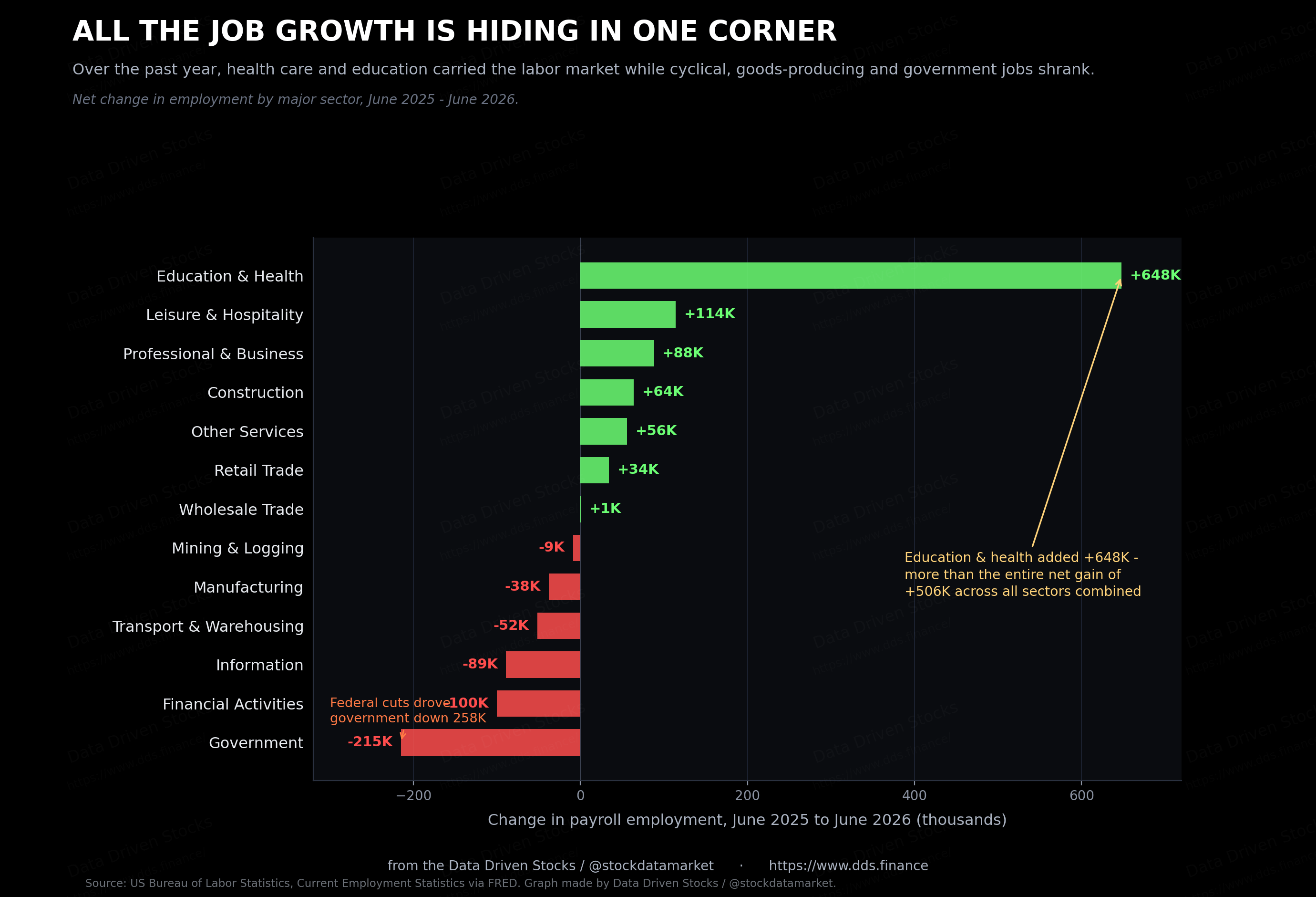
Financial activities lost 100,000. Information shed 89,000. Transportation and warehousing dropped 52,000, and manufacturing fell 38,000. Government came down 215,000 on net, and the reason there matters: the federal workforce alone fell 258,000 over the year, the result of the deep staffing cuts across federal agencies. State government slipped 47,000, while local government added 90,000 and cushioned the total.
Strip out health care, education and social assistance, and there is barely a growth engine left. Those sectors are driven by demographics and demand for care, not by the business cycle. When the jobs that exist are concentrated in the least cyclical corner of the economy, and the cyclical parts are flat or shrinking, the labor market is not firing on many cylinders. It is running on one.
Why unemployment stays low when hiring is this weak
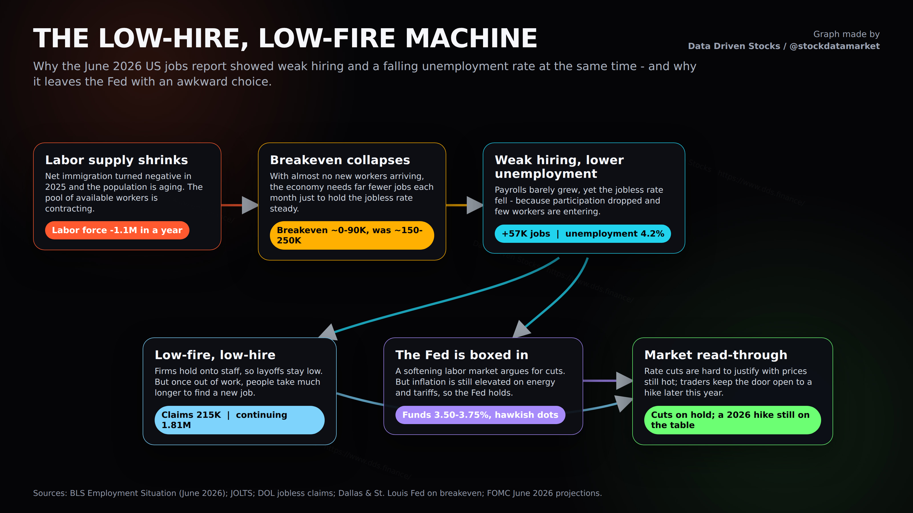
Here is the part that ties everything together. The reason a 57,000 print can coincide with a falling jobless rate is that the number of workers arriving each month has collapsed. You do not need many new jobs to keep unemployment steady if almost no one new is joining the line.
The US civilian labor force is now smaller than it was a year ago, down about 1.1 million. Rewind two years and it was growing by roughly 3 million a year. That is a genuine reversal, and it has one dominant cause: net immigration went into reverse in 2025. Dallas Fed economists estimated that net unauthorized immigration was negative in the second half of last year, averaging around 55,000 fewer people a month, for a total of roughly 548,000 over 2025. Layer an aging native-born population on top, and the pool of available workers stops growing.
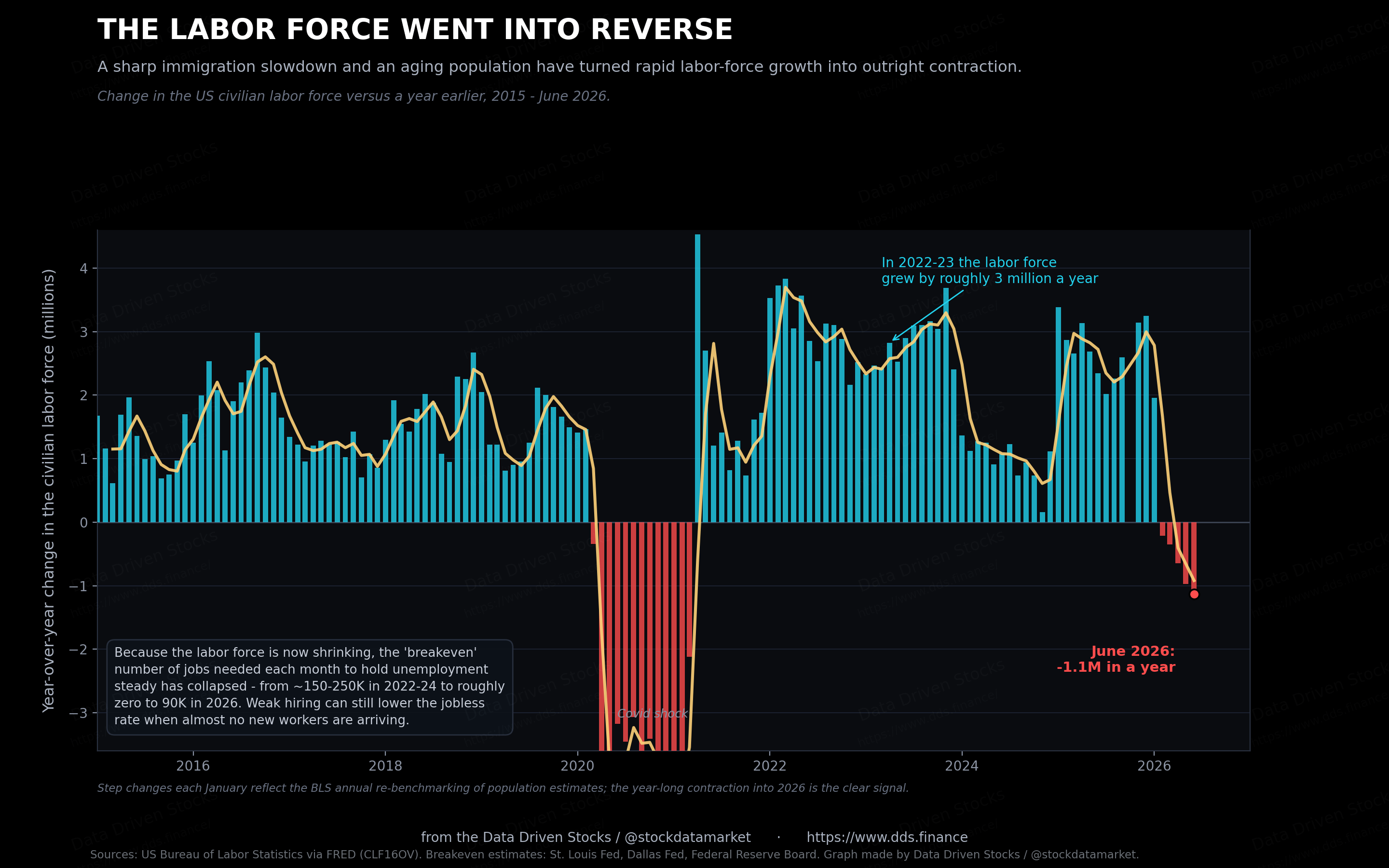
Economists have a name for the number of jobs the economy needs each month just to hold unemployment flat: the breakeven pace. In 2022 through 2024, when immigration was strong, estimates ran from roughly 150,000 to as high as 250,000. Those estimates have since been torn up. A St. Louis Fed analysis put the 2026 range at 15,000 to 87,000. The Federal Reserve Board’s own staff went further, writing that breakeven could be near zero, under 10,000 a month, which means “employment growth in any given month is almost as likely to be negative as it is to be positive.” Dallas Fed economists calculated that breakeven turned slightly negative in the back half of 2025.
Put that together and June’s 57,000 stops looking like failure. Against a breakeven that may be somewhere between zero and 90,000, it is enough to hold the line, or even nudge unemployment down. The weak headline and the low jobless rate are two readings of the same underlying fact: not much hiring, and not much labor supply either. US Bank’s economists reached the same conclusion, describing a market where both labor demand and labor supply have dropped at once, a kind of defensive stability in a low-hire, low-fire economy.
The participation puzzle is mostly about age
The falling participation rate gets treated as a mystery, or as evidence of some hidden weakness, discouraged workers giving up. Most of it is simpler than that. It is demographics.
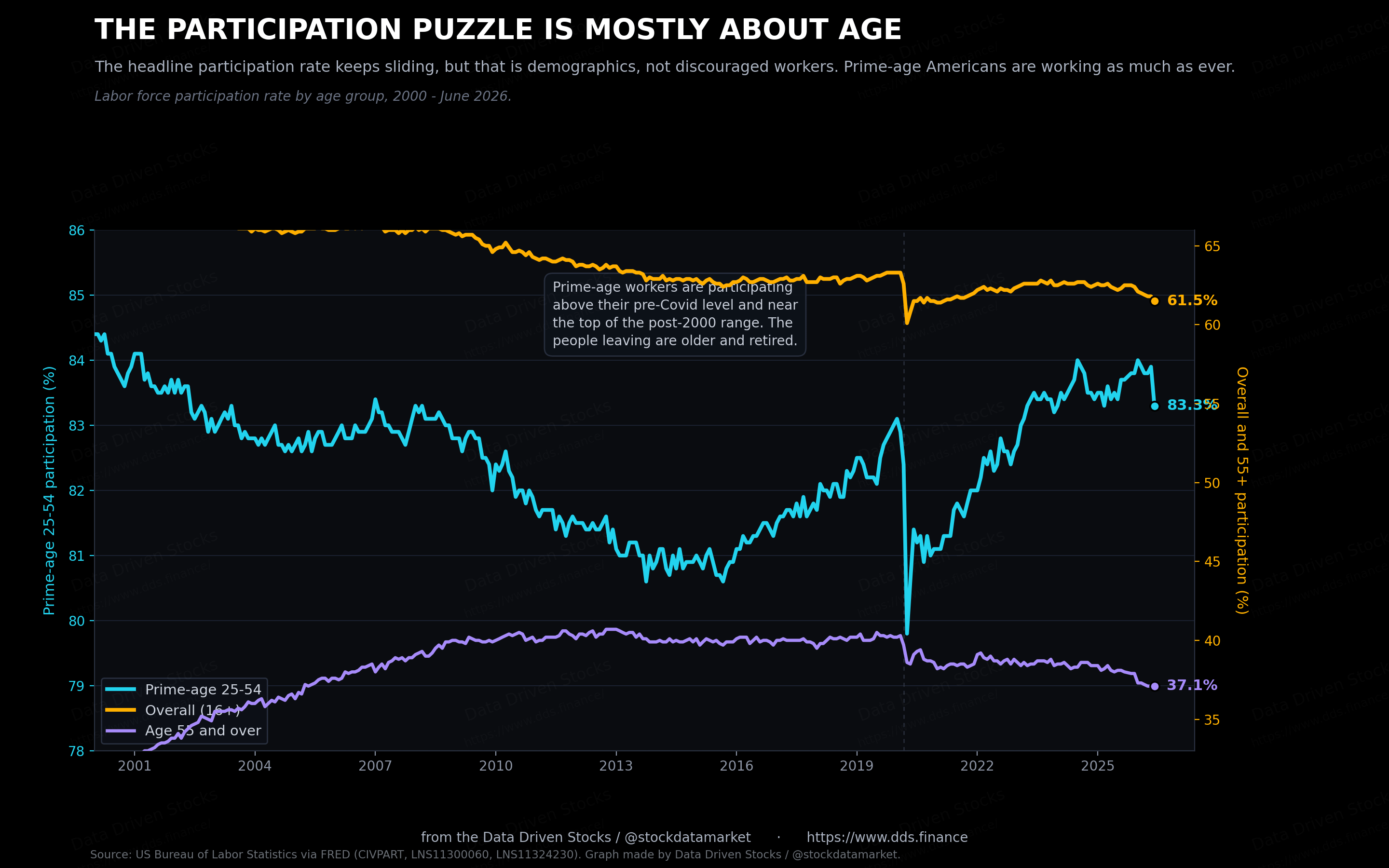
Split participation by age and the story clears up. For Americans aged 25 to 54, the prime working years, participation is 83.3%. That is above where it stood before Covid and near the top of its range for the past two decades. Prime-age workers are not dropping out. The decline is concentrated among people 55 and older, whose participation has fallen from about 40% before the pandemic to 37% now, as the baby boomers move into retirement. As the population ages, a larger share sits in the low-participation older bracket, and the overall rate drifts down even when every age group holds steady. That drift is a headwind on labor supply that will not reverse, and it is a big part of why breakeven has fallen so far.
June’s one-month drop to 61.5% was sharp, and single-month household numbers are noisy, so some of it will likely bounce back. The trend, though, is real and slow-moving.
Why the two numbers move together now
Participation and unemployment are tied together by arithmetic. The unemployment rate is the number of people looking for work divided by everyone in the labor force, and the labor force only counts people who are working or actively searching. Stop searching, and you drop out of both the top and the bottom of that fraction. The bottom of it, the denominator, is the part doing the work right now. Nobody has to hire anyone for the rate to improve. People just have to leave the count. When participation falls, it pulls the unemployment rate down on its own, whether or not a single job was added.
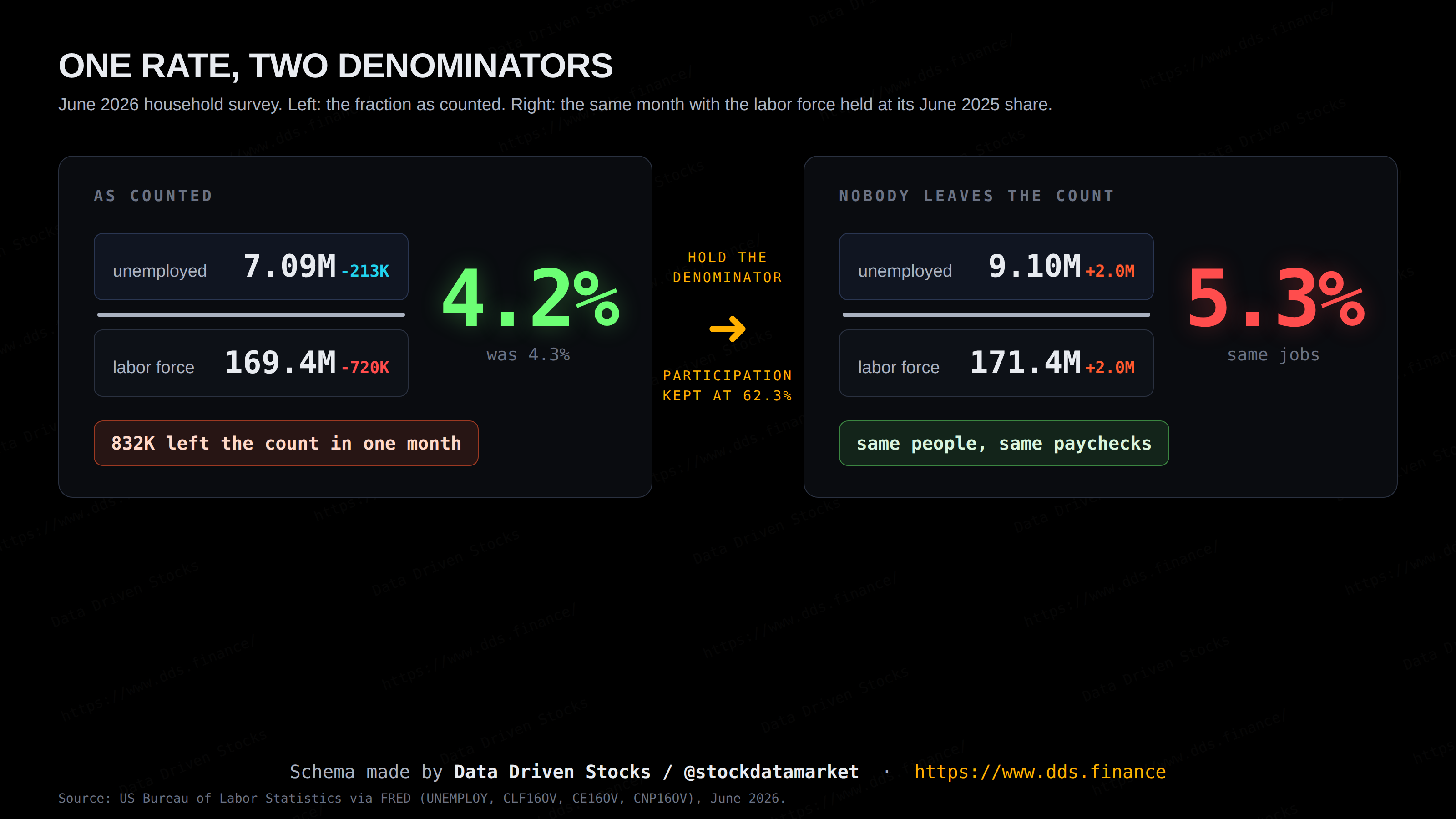
June was a clean example. The household survey showed 507,000 fewer people working, which by itself would push unemployment up. The rate fell anyway, because an even larger number left the labor force entirely. A lower unemployment rate that month meant fewer people searching, not more people hired.
To see how much this matters, hold participation where it was a year ago and recompute the rate. If the same share of Americans were in the labor force today as in June 2025, the unemployment rate would be about 5.3% instead of 4.2%, more than a full point higher. Same people, same jobs, same paychecks. The only thing that changes in that exercise is the denominator, and the denominator alone is worth 1.1 points of measured health.
That calculation is deliberately generous. It assumes everyone who stopped looking would otherwise be counted as unemployed, and some of them simply retired, so the real figure sits between the two lines. Even at 5.3%, effective unemployment would be close to its long-run average of 5.7%, which is hardly a crisis. The point is the direction. The gap between the two lines has widened all through 2026.
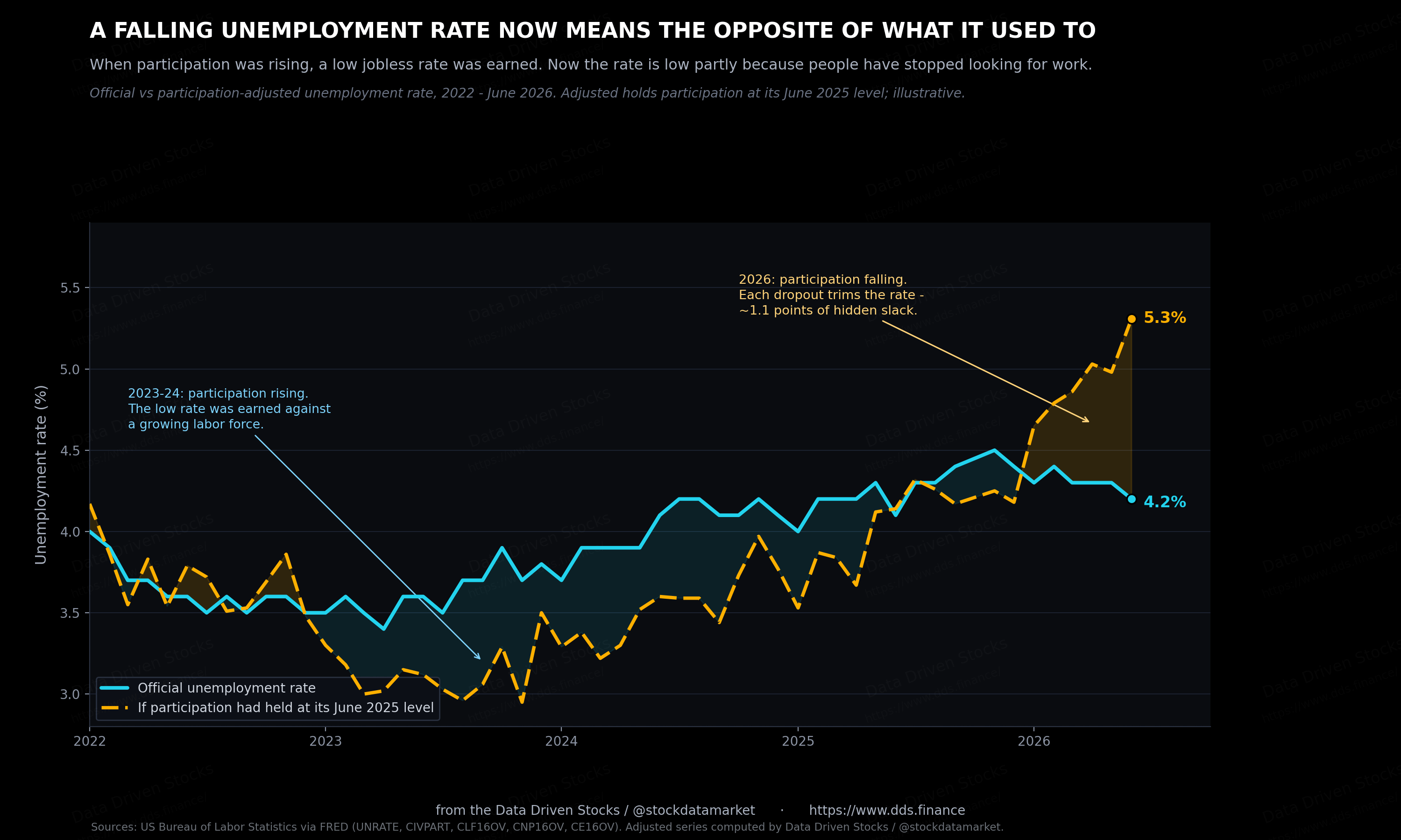
The shape of the chart gives it away. Through 2023 and 2024 the adjusted line ran below the official one, because participation was climbing back after the pandemic, and every returning job seeker who had not yet found work pushed the measured rate up. A falling unemployment rate back then was earned against a growing labor force. Now it is the reverse. Participation is sliding, and each person who gives up the search trims the rate. The number is falling in both periods, but it means opposite things.
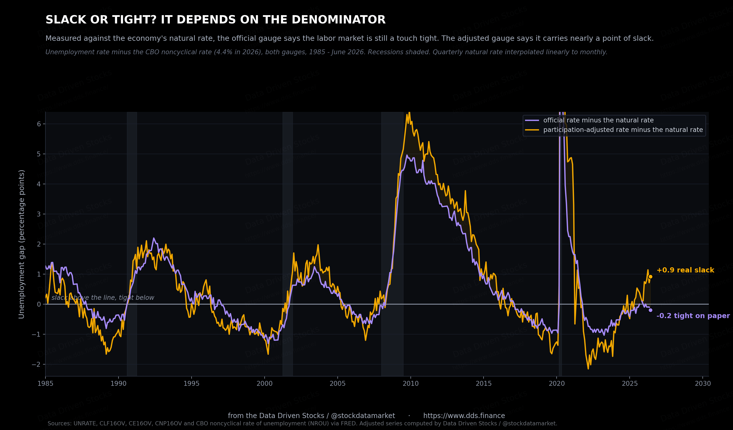
There is a formal name for what this measures. Economists call the distance between the unemployment rate and the economy’s natural rate the unemployment gap, and it is the number that answers the most basic question about a labor market: does it have slack. The Congressional Budget Office puts the natural rate at 4.4% right now. Run the official rate against it and the gap is minus 0.2 points, meaning on paper the labor market is still a touch tight, with no spare capacity at all. Run the adjusted rate against the same 4.4% and the gap flips to plus 0.9, nearly a full point of slack. One economy, one benchmark, two opposite answers, and which one you get depends entirely on the denominator. Since 1949 the two gaps have split like this, official at or below zero while the adjusted shows close to a point of slack, in just six months out of more than nine hundred. Two of the six are this spring.
The heat has come out of labor demand
The other side of the ledger, demand for workers, has cooled hard from the 2022 frenzy without falling off a cliff. Job openings in the May JOLTS data stood at 7.6 million, down from a peak above 12 million in early 2022. Back then there were nearly two openings for every unemployed worker. Now it is about one to one, roughly where things sat before the pandemic.
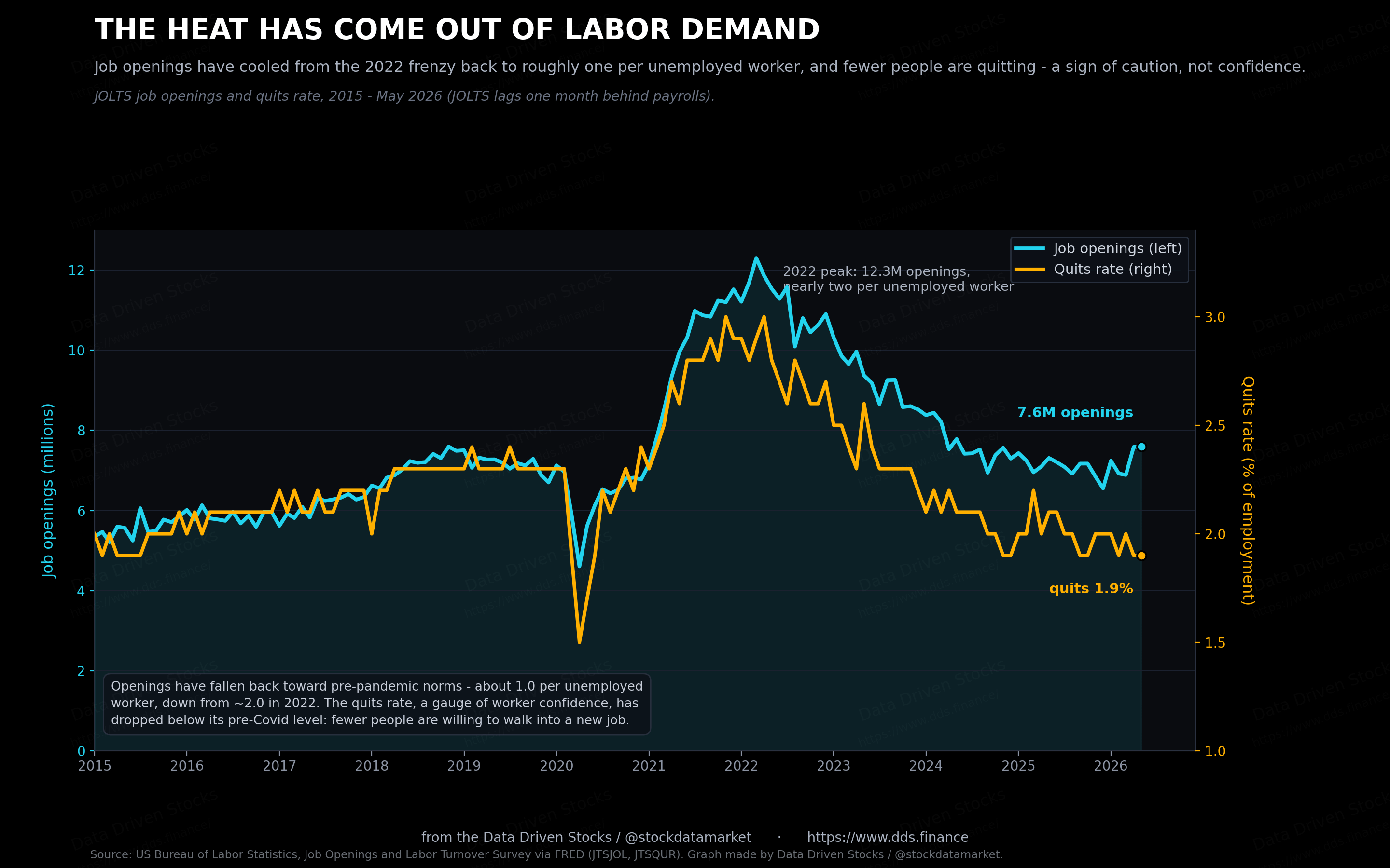
The quits rate is the tell worth watching. At 1.9%, it has slipped below its pre-Covid level. Quits are a confidence gauge: people walk away from a job when they are sure they can land a better one. Fewer people are walking. That fits everything else here. The frenzy is over, workers are holding on to what they have, and the churn that pushed wages up in 2022 has drained out of the system. Also weak hiring and weak quiting is a common pre-recession sign.
Nobody is being fired, but nobody is being hired either
This is where the phrase the Fed has leaned on, “low-hire, low-fire,” earns its keep. Companies are not laying people off. Weekly initial jobless claims have sat near 215,000 through the first half of 2026, which is low by any historical standard. Firms went through the pain of hiring in a tight market and are reluctant to let staff go.
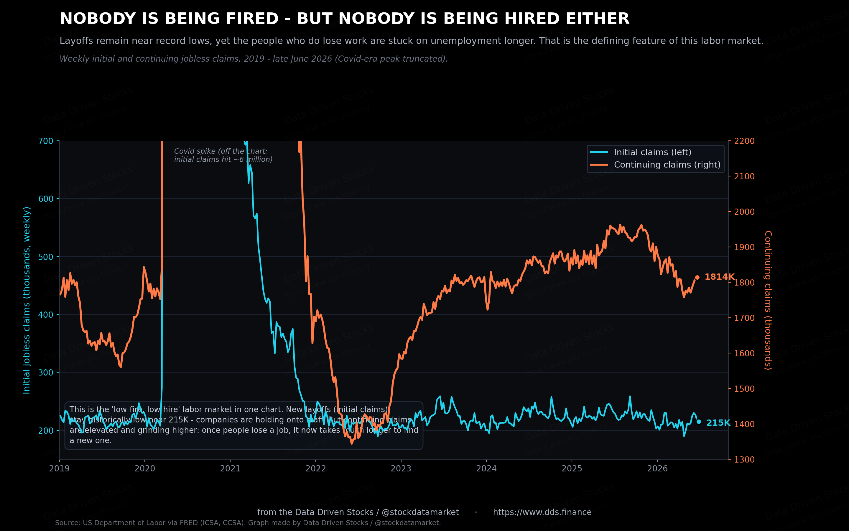
The catch is on the other line. Continuing claims, the count of people still collecting benefits week after week, are elevated at about 1.81 million and have been grinding higher. The message is blunt. If you have a job, you are probably safe. If you lose one, it now takes a long time to find the next. For anyone job hunting, that gap between low layoffs and slow rehiring is the part of the report that bites. So the job market does not absorb new people and does not rehire.
By historical standards, 4.2% is still low
For all of that, it is worth keeping perspective on the headline rate itself. At 4.2%, unemployment is lower than it has been in roughly three-quarters of all months since 1948. The long-run average is 5.7%. The 50-year low, hit in April 2023, was 3.4%, so we are not far off the best readings in living memory.
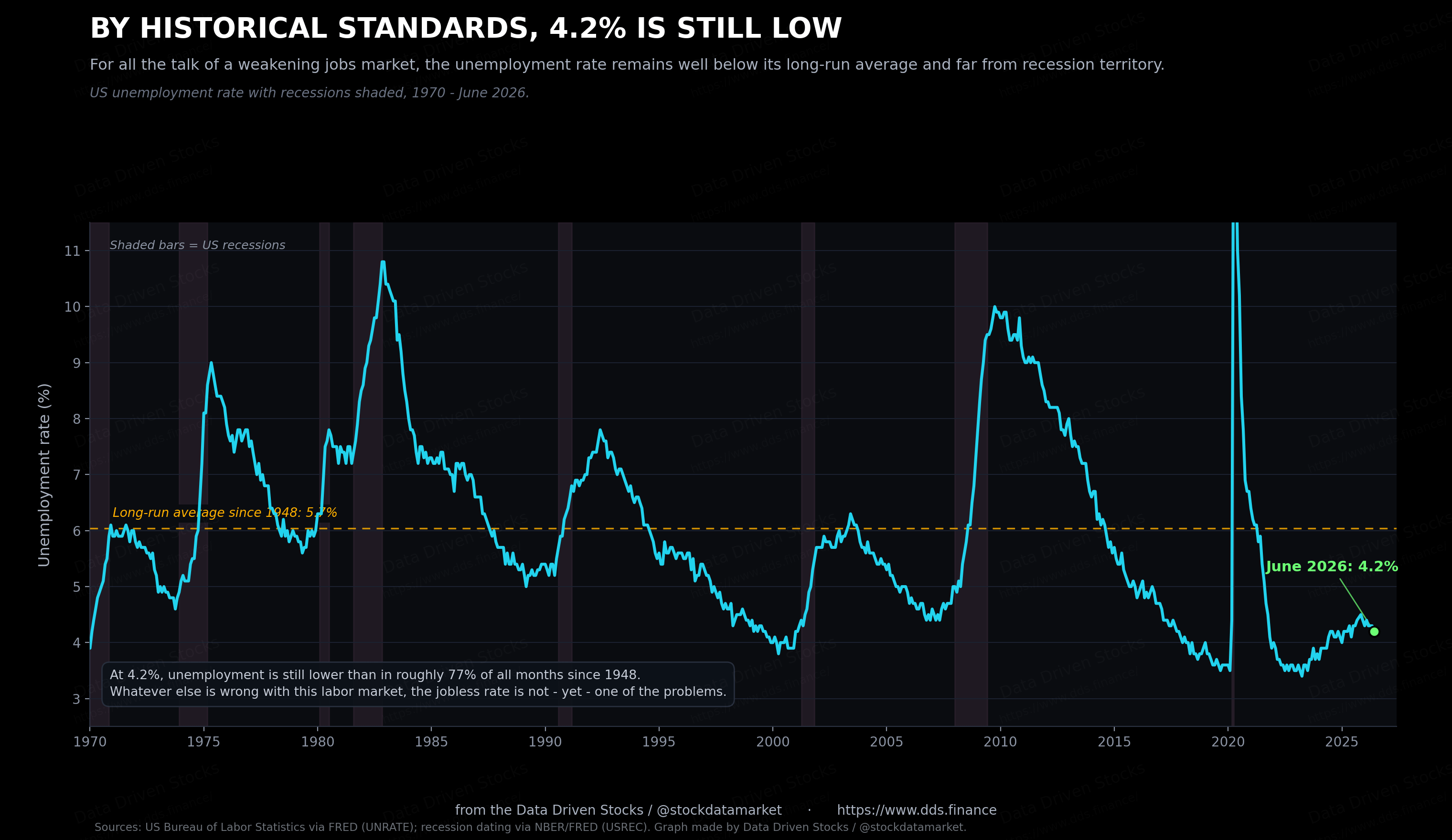
This is the honest tension in the data. The rate is low, and it is higher than the 4.1% of a year ago, and it is being held down by a shrinking labor force rather than by strong hiring. All three of those are true at once. A weak labor market and a low unemployment rate are no longer opposites.
How the whole thing connects
The chain runs like this. A shrinking labor supply, from lower immigration and an aging population, pushes the breakeven pace of hiring down toward zero. That lets weak payroll growth coexist with a low, even falling, jobless rate. Firms respond by hoarding the workers they have, which keeps layoffs down but makes rehiring slow. And that leaves the central bank staring at a labor market that looks soft but is not throwing off the rising-unemployment signal it usually watches for.
The Fed is boxed in
Normally a run of weak jobs reports would have the Fed cutting. This cycle is not normal. Inflation has been running above the 2% target for five years, and the most recent flare-up owes a lot to the energy shock from the Iran war and to the tariffs working their way through prices. The Fed’s preferred core gauge is now projected at 3.3% for 2026, revised up from 2.7% just three months earlier.
So the Fed held. It left rates at 3.50% to 3.75% at its June meeting, where they have been since the last cut in December 2025. The new chair, Kevin Warsh, described the jobs picture as “steady” and stripped the easing bias out of the statement. The June dot plot turned hawkish enough that nine of eighteen officials pencilled in at least one rate hike this year, on the view that inflation, not employment, is the side of the mandate that needs attention. The unemployment gap from earlier in this piece explains part of that posture. On the official gauge the labor market still reads a touch tight, which is the number the hawks can point to. On the adjusted gauge it carries nearly a point of slack, which would normally argue for cuts. The committee is steering by the first one.
A weak jobs market and hot inflation pull in opposite directions, and it leaves policy stuck. The June report did take some pressure off. “For the Fed, this number is fine,” Jefferies economist Thomas Simons wrote, adding that the softening “suggests that rate hikes are very unlikely to be necessary this year.” Traders pulled a September hike off the table after the release, and the two-year Treasury yield, the market’s cleanest read on rate expectations, fell to 4.13%. Even so, the Fed’s own dot plot still leaned toward at least one increase before the end of the year. Principal’s Seema Shah made the same point from the other direction: the slowdown “reinforces the view that the Federal Reserve is under little pressure to tighten policy.” For now, the most likely path is that the Fed does nothing and waits. Which seems somehow good with elevated inflation (4.2%) and cracking job market.
Where the jobless rate goes from here
Nobody should pretend to know the exact path, so treat what follows as scenarios rather than forecasts, and certainly not as investment advice. The Fed’s own June projections have the unemployment rate at 4.3% at the end of both 2026 and 2027, essentially flat from here. That is the baseline: a labor market that muddles along, with weak hiring offset by an equally weak inflow of workers.
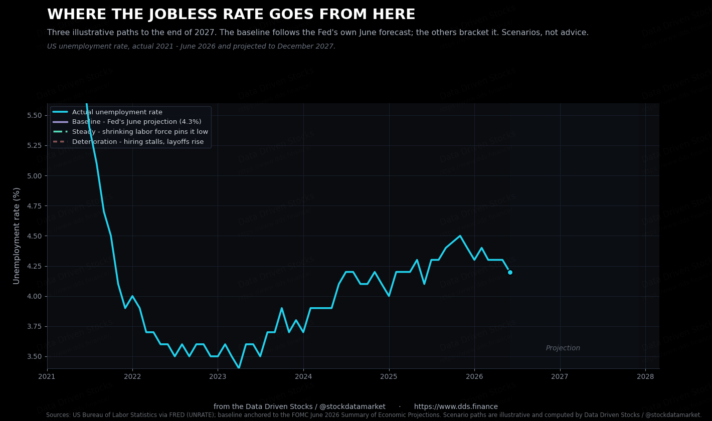
The two brackets around that baseline are the risks. On one side, the shrinking labor force keeps the rate pinned near 4.0% to 4.2% even as hiring stays soft, simply because so few new workers are arriving. On the other, the low-fire truce breaks: if companies finally start cutting staff into slower demand, the same thin labor market that has held the rate down offers little cushion on the way up, and unemployment could drift toward 4.9% by the end of 2027. The gap between those paths is wide, and which one plays out depends less on hiring than on whether layoffs stay as low as they have been.
Bottom line
The June jobs report was weak, and the unemployment rate fell, and both readings are honest. Hiring has slowed to a crawl, concentrated in health care and education, while the cyclical parts of the economy stall. The jobless rate is holding near historic lows mainly because the labor force has stopped growing, not because employers are scrambling for staff. Hold the labor force at last June’s share and the same report reads 5.3%. Layoffs are rare, which is the good news, and rehiring is slow, which is not.
None of that is a crisis. It is also not the clean picture of strength that a 4.2% unemployment rate suggests on its own. Hiring has slowed, and the readings that used to signal trouble mean less when the labor force is shrinking underneath them. From here, the layoff rate matters more than the payroll count. As long as layoffs stay low, this holds together. If they climb, the same shrinking labor force that has cushioned the jobless rate will do very little to stop it rising. And the rise will be very very very sharp and fast (few months) as those two effects accelerate each other.
What a rising jobless rate would do to stocks
So far this has been about the labor market on its own terms. But a lot of readers are here because they hold stocks, and the fair question is what a softer jobs market means for the market itself. The answer depends almost entirely on whether the softening turns into rising unemployment, and how fast.
