

The VIX: When Wall Street Starts Sweating - Part 1 (The “Fear Gauge,” Decoded for Humans - Upgraded version)
If the stock market had a stress thermometer, it would be the VIX. Here is how to read it - without a quant degree.

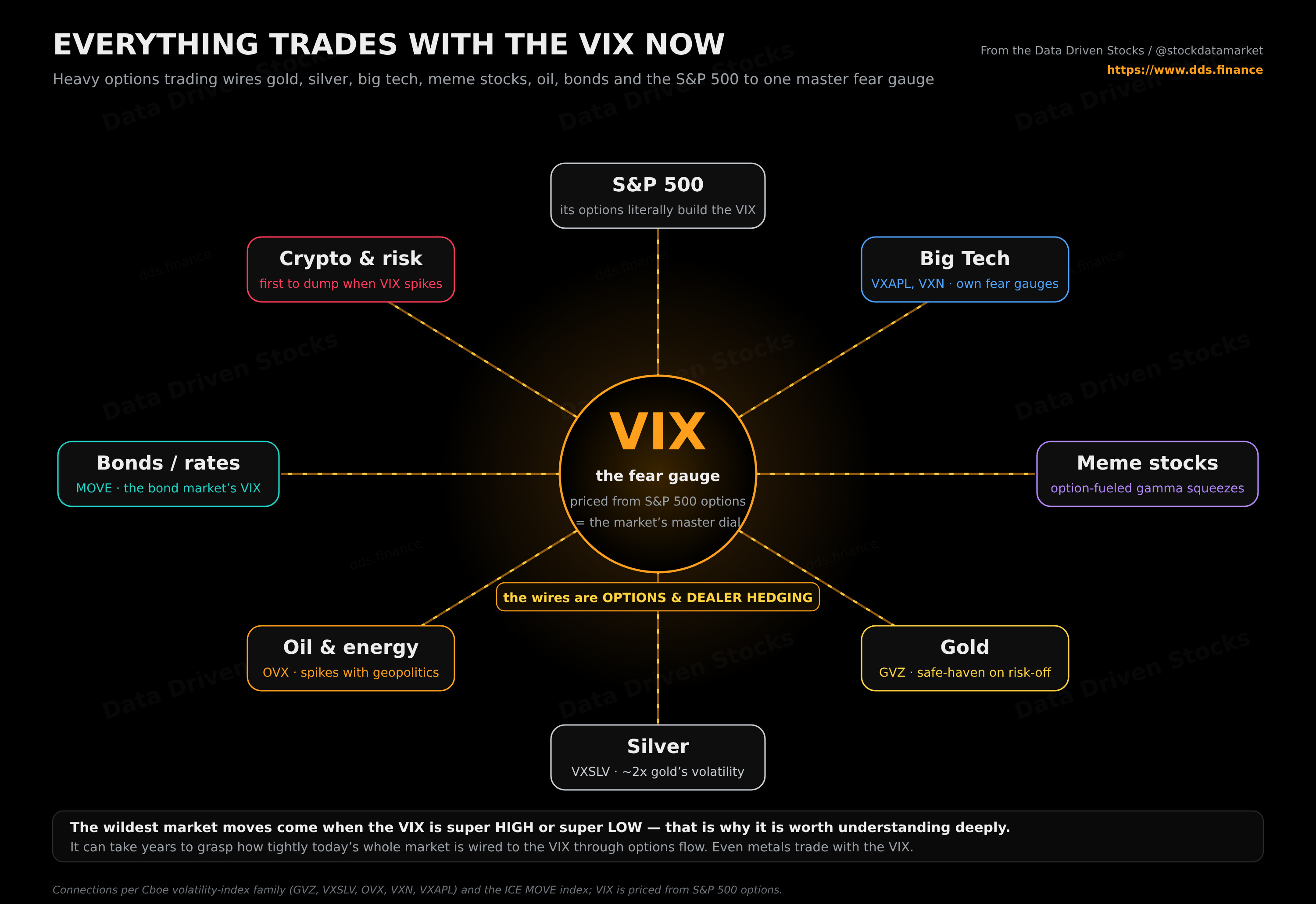
The wildest stock markes moves are either when VIX is super high or is super low. That’s why you should deeply understand what is VIX and how to use it to your advantage. But it may take years to fully understand how deep is nowadays the connection between VIX and the whole stock market. Even metals trade with VIX!
This is your Part 1. No jargon walls, no formulas thrown at your face. By the end you will know what the VIX is, why it exists, how it is built, how stocks shove it around, how it shoves stocks right back, and - the part most explainers skip - exactly how it changes the price of the options people use to bet on, or protect against, all of this.
So… what is the VIX?
The VIX is a single number that estimates how wildly the S&P 500 might swing over roughly the next 30 days. Not whether it goes up or down - just how violent the ride could be.
Two analogies do most of the heavy lifting here. The first is a weather forecast. “Stormy” does not tell you which way the wind blows; it tells you how rough things might get. The second is the price of insurance. When people are scared, they buy more cover, the cover gets expensive, and that rising price is the signal. The VIX is built from the price of the market’s insurance, which is why it earned the nickname the “fear gauge.” Strip away the mystique and it is the market quietly admitting: I’m not sure what’s coming, so I’m paying up for protection.
That is the whole intuition. Everything below is just detail underneath it.
A quick origin story
Back in 1993, the Cboe (the Chicago options exchange) launched the original VIX. The idea, developed by Professor Robert Whaley, was to take the prices of at-the-money S&P 100 options and back out a single, real-time number for expected 30-day volatility - a dashboard reading for “how nervous is the market right now?” It caught on fast and quickly became the benchmark the financial press reached for whenever stocks got jumpy.
Ten years later, in 2003, Cboe reworked the whole thing with input from Goldman Sachs. The modern VIX - the one you see quoted today - switched to S&P 500 (SPX) options and, crucially, started pulling in a wide range of strike prices instead of just the at-the-money ones. That change turned volatility from an abstract concept into something the market could actually trade and hedge. Cboe listed VIX futures in 2004 and VIX options in 2006, but those tradable products are a Part 2 problem.
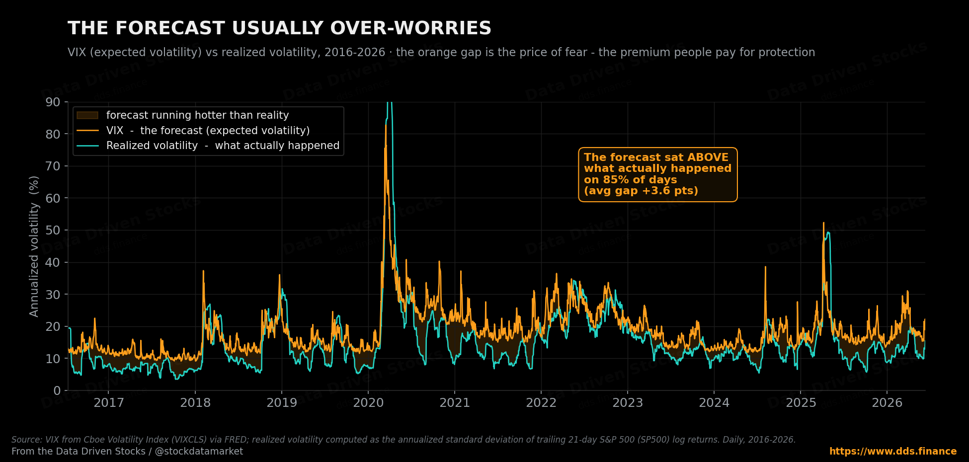
“Expected” volatility versus what actually happens
Here is a distinction worth tattooing somewhere visible: the VIX measures expected volatility, not realized volatility.
Expected volatility is the forecast - “chance of storms over the next month.” Realized volatility is the weather that actually arrived - “yep, it poured.” The VIX is the forecast, and it is built entirely from option prices, which behave like insurance premiums on the S&P 500. When traders brace for bigger moves, they pay more for that protection, and that higher premium pushes the VIX up.
The catch: expected is not guaranteed. The VIX is the market’s best collective guess. Reality can come in calmer or far nastier than what was priced in. It is a forecast, not a promise.
And here is the fascinating part: the forecast tends to run a little scared. If you line up the VIX against the volatility that actually showed up in the following weeks, the VIX sat higher than reality about 85% of the time over the past decade, by roughly three and a half points on average. That persistent gap is not a flaw - it is the price of fear. People pay a premium for protection the same way they overpay, slightly, for insurance they hope never to use, and that premium lives inside every VIX reading.
How to read the number (the part everyone skips)
The VIX is quoted like a percentage, but the cleanest way to think about it is as annualized expected volatility. So a VIX of 20 means the market is roughly pricing in 20% volatility over a year.
But you probably care about the next month, not the next year. There is a simple piece of mental math for that, and it holds up under scrutiny:
Typical 30-day move ≈ VIX ÷ 3.5
Where does the 3.5 come from? Volatility scales with the square root of time, and a month is one-twelfth of a year. The square root of 12 is about 3.46, and using calendar days (√(365÷30)) gives about 3.49, so dividing by 3.5 is a clean, honest shortcut. Run the examples and they line up neatly: a VIX of 12 implies a typical 30-day swing of roughly ±3.4%, a VIX of 20 implies about ±5.7%, a VIX of 30 climbs to around ±8.6%, and a VIX of 50 means the market is bracing for moves on the order of ±14.3% in a single month.
The easiest way to feel this is to picture a $100 index and watch the cone of likely outcomes widen as the gauge rises. At a calm VIX of 12, a month from now the market is expected to land somewhere between about $97 and $103. Crank the VIX up to a panic-level 50 and that band blows out to roughly $86 to $114 - the same index, the same month, but a wildly different range of plausible endings.
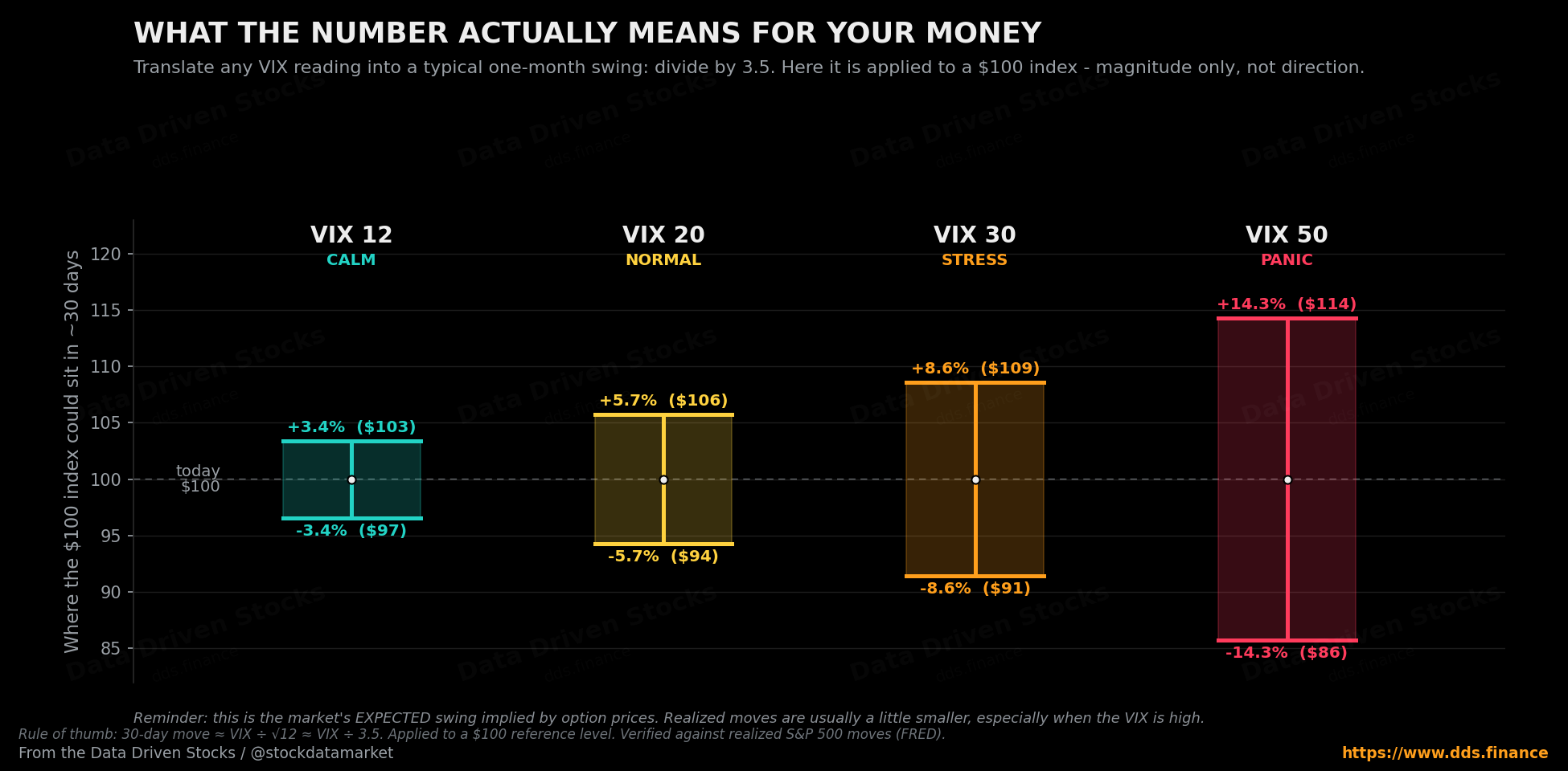
Two warnings so nobody misreads it. First, this is about magnitude, not direction - a VIX of 30 says “expect roughly 8-9% swings,” not “stocks will fall 8-9%.” Second, it is an expectation, and markets routinely do more or less than expected.
How the VIX is actually built (no formula torture)
Under the hood, the VIX is extracted from real S&P 500 index option prices - not vibes, not a survey, and not yesterday’s returns. The recipe, in human terms, goes like this.
It looks at two option expirations, one a little before 30 days out and one a little after, so the result can be blended into a constant 30-day measure. For each, it uses the midpoint of live bid/ask quotes across a wide range of strike prices - puts and calls, especially the out-of-the-money ones, not just the option struck right at the current price. It runs those prices through a calculation that produces an estimate of variance (which is just volatility squared), takes the square root to get back to volatility, and scales the result into the VIX number you see. The core chain is short and worth remembering: option prices → implied volatility → 30-day expected market turbulence.
(it’s for the VIDEO, substack doesn’t allow to put caption :-( ) The volatility feedback loop in one turn. Stocks drop, traders rush to buy downside protection, that demand lifts option prices, the VIX (built from those prices) spikes, automated risk systems respond by cutting exposure, and that selling can press prices lower still - which feeds the next turn. The loop is real but not magical; most days it never gets going.
The bit the original explainers gloss over: how the VIX changes option prices
This is where the VIX stops being an abstract gauge and starts costing - or making - people real money. The relationship runs both ways. The VIX is built from option prices, so when the VIX rises it is, almost by definition, telling you that options have gotten more expensive. If you have ever wondered why a put or call you were eyeing suddenly doubled in price on a scary day even though the stock barely moved, this is the answer.
To make it concrete, picture a plain stock trading at $100 and an at-the-money call option on it. Using standard option-pricing math, here is what that 30-day call costs as the implied volatility (think of it as a single stock’s personal “VIX”) changes:
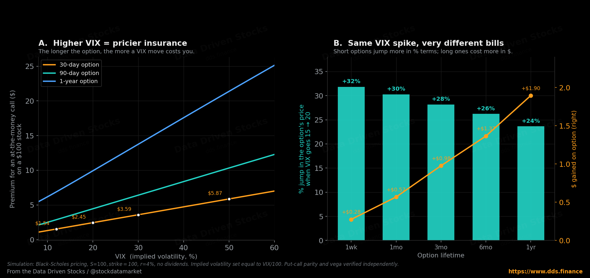
A few things fall out of that picture, and they matter whether you trade options or just want to understand the headlines.
The premium scales almost in a straight line with volatility. Double the implied vol and you roughly double what an at-the-money option costs. That is the single cleanest way to understand the VIX’s grip on markets: a VIX spike is, mechanically, an across-the-board repricing of every option on the S&P 500 to a higher number. Nothing about the index level needs to have changed for your protection to get expensive.
Short-dated options are the drama queens. In percentage terms, a one-week option reacts hardest to a volatility jump - its price can leap by a third on a five-point VIX move. That is why, in a panic, near-term options look like they are on fire. But the same move puts more actual dollars into a longer-dated option, because there is simply more time-value in it to inflate. Short traders feel the percentage; long-term hedgers pay the dollars.
This is also why “buying protection after the crash” is usually a bad trade. By the time the VIX has spiked, the insurance is already expensive - you are buying the umbrella in the downpour, at downpour prices. The cheap time to hedge is when the gauge is calm and nobody wants to. This is where you make money from options!
How the stock market pushes the VIX around
The classic pattern: when the S&P 500 sells off fast, the VIX usually jumps. The mechanism is the insurance story playing out in real time. Falling prices send investors scrambling to buy downside protection (puts); that surge in demand lifts option prices; higher option prices mean higher implied volatility; higher implied volatility is a higher VIX.
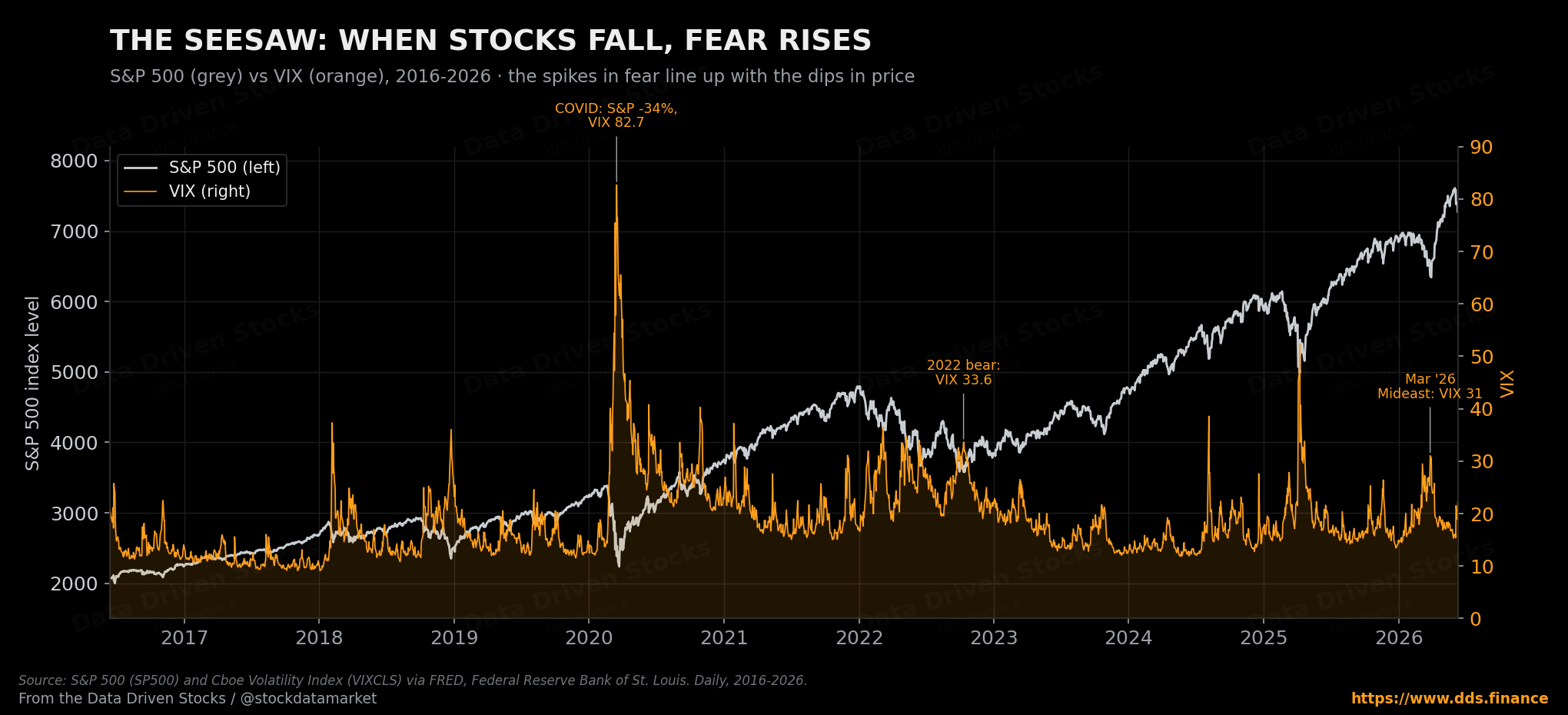
There is also an asymmetry baked in. Markets tend to fall faster than they rise - the “elevator down, escalator up” cliché exists for a reason - so that downside-panic premium gets priced into options very quickly. When stocks instead grind higher calmly, nobody is bidding aggressively for protection, volatility expectations relax, and the VIX drifts lower. The result is that the VIX often trades like an inverse shadow of the index.
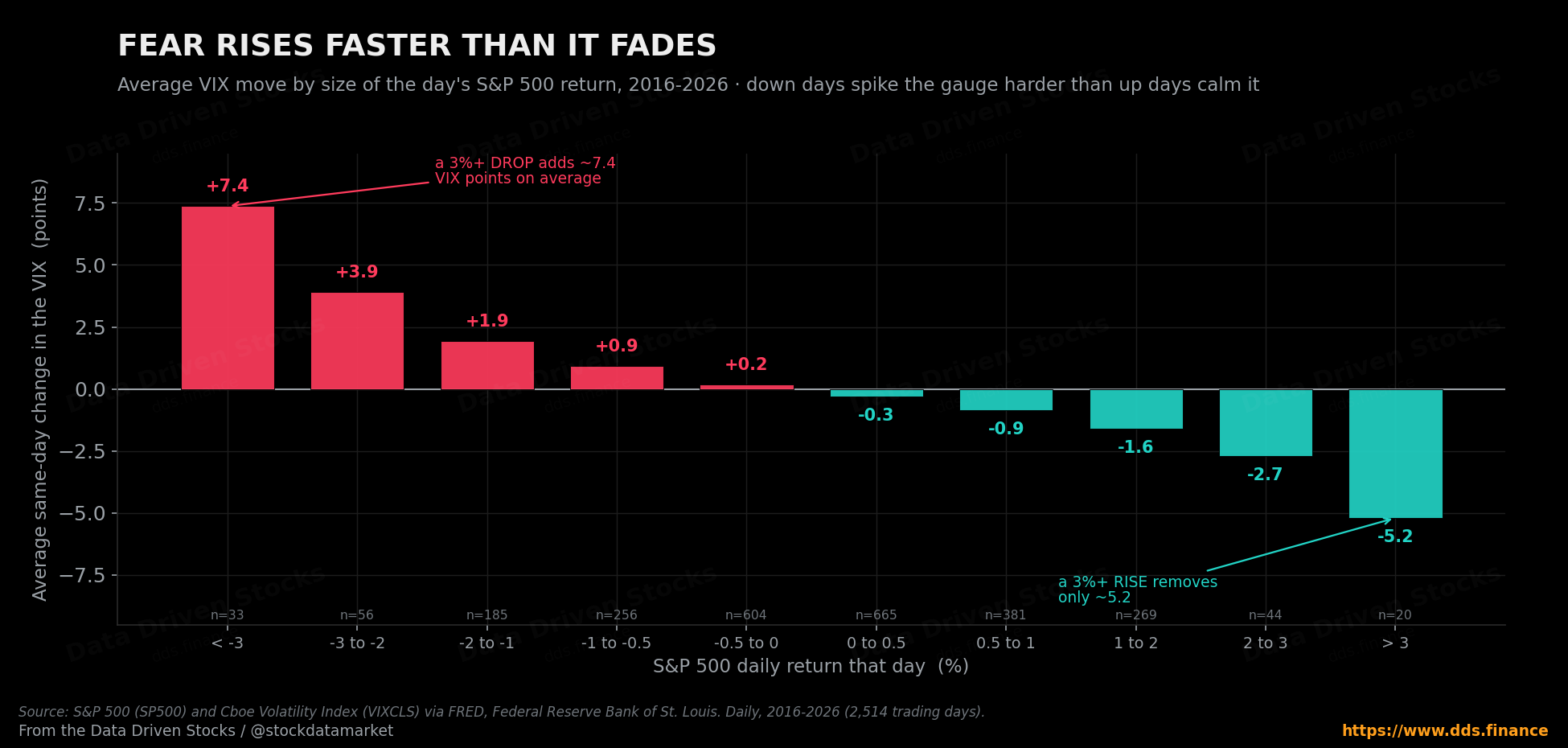
This asymmetry is not just a saying; it shows up cleanly in the data. If you sort every trading day of the past decade by how much the S&P moved and then average the VIX’s reaction, the response is lopsided. A really ugly day, one where the S&P drops more than 3%, adds about 7.4 points to the VIX on average. But an equally large up day, a rally of more than 3%, only takes about 5.2 points back off. Fear arrives in a hurry and leaves slowly, which is exactly why a gauge built from the price of protection spends so much of its time elevated after a shock and so little time celebrating the recovery.
How strong is that shadow overall? Using daily data from FRED over the past decade, the correlation between the S&P 500’s daily return and the daily change in the VIX is about -0.79. That is a genuinely strong inverse relationship - not perfect, not tick-for-tick, but tight enough to explain why the two charts look like mirror images.
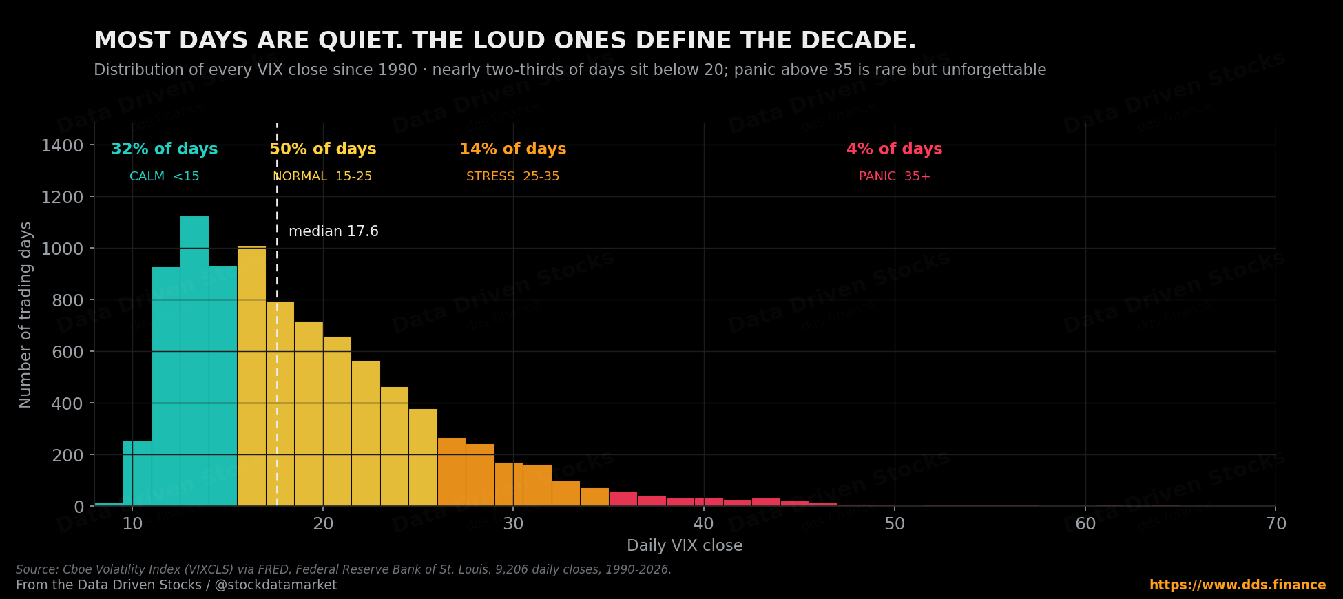
Most of the time it’s quiet. The loud days define the decade.
Here is something that surprises people: the VIX spends the overwhelming majority of its life in unremarkable territory. Across every trading day since 1990, roughly 32% of closes were below 15 (calm), about 50% sat between 15 and 25 (normal), only about 14% landed in the 25-35 stress band, and a mere 4% breached 35 into outright panic. Put differently, more than four days in five close below 25. The distribution has a long, thin right tail - and that tail is where all the famous stories live.
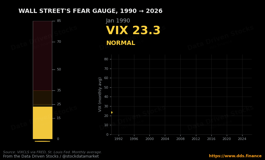
To feel how the gauge actually breathes - how it idles for years and then erupts - it helps to watch it move rather than read about it.
How the VIX pushes the stock market back (the feedback loop)
The honest framing is that the VIX is mostly a measurement - a thermometer, not a remote control. But a thermometer can start to influence the patient when enough big money treats its reading as a trigger. There are three main channels.
First, risk management kicks in automatically. A lot of large strategies - volatility-targeting funds, risk-parity portfolios, certain systematic trend-followers - are wired to hold less when volatility is high. A rising VIX makes “risk look expensive,” so these strategies mechanically trim exposure, and that trimming is selling.
Second, options dealers hedge dynamically. When the market drops sharply and put demand surges, the dealers on the other side can be forced to hedge in a way that adds fuel to the move - selling into weakness precisely because it is weak. During stress, that activity can amplify short-term swings rather than dampen them.
Third, psychology and headlines. “VIX spikes to a six-month high” becomes a headline; the headline shapes positioning; positioning becomes price. Fear rises, the VIX rises, people de-risk, the market gets choppier, and the VIX stays elevated. None of this is guaranteed or supernatural - but it is a real behavioral-and-mechanical loop, and on bad days it can become self-reinforcing.
The cautionary tale that ties this together is February 5, 2018 - “Volmageddon.” The VIX more than doubled in a single session, closing up about 116% (from 17.31 to 37.32), its largest one-day percentage jump on record. The S&P 500 itself fell only about 4% that day. The disproportionate damage came from a popular product that bet against volatility: as the VIX surged, that product was forced to buy volatility futures to rebalance, which pushed those futures higher, which forced more buying - a textbook feedback loop. The fund lost roughly 96% of its value almost overnight and was shut down within weeks. The machine that turns a modest sell-off into a blow-up is exactly what Part 2 will dig into.
What the VIX is NOT
Three quick myths to retire before we wrap.
It is not a direction predictor. A high VIX does not mean stocks must fall tomorrow - it means bigger moves, in either direction, are being priced in. It is not “past volatility.” It is built from option prices, so it is forward-looking by construction. And you cannot buy the VIX itself like a stock; it is an index. The tradable wrappers built around it - futures, options, ETFs and ETNs - are a separate animal, with their own traps, and that is Part 2’s territory.
Part 1 takeaway
If you remember nothing else from this: the VIX is the market’s 30-day stress forecast, extracted from S&P 500 option prices. Stocks fall fast → demand for protection jumps → option prices rise → the VIX spikes → automated risk systems tighten up → markets can get even messier and less predictable. That is the core loop. And because the VIX is the price of options, every spike in the gauge is, in plain terms, the moment your insurance got expensive.
When VIX is low, market tends to be more predictable and much easier to trade and profit (either up or down direction). So usually daily traders lose the most when VIX is high. One Trump post or a peace deal, VIX sharply corrects and your puts (or even calls) become worthless.
Part 2 will get into how people actually trade volatility - and the surprisingly creative ways those products manage to blow up accounts even into the debt territory.
Sources
Cboe Global Indices - Volatility Index Methodology: Cboe Volatility Index (VIX Index) (history, 1993 launch on S&P 100 / OEX options, 2003 reformulation onto S&P 500 / SPX options with Goldman Sachs, near- and next-term expiration selection, the wide-strike “implied variance → square root → VIX” calculation, and the “fear gauge” framing).
Cboe Global Markets - VIX Volatility Products and VIX Historical Data (VIX as the market’s measure of near-term volatility from SPX option prices; VIX futures introduced March 2004 and VIX options in 2006; the original 1993-methodology history now tracked as the VXO).
World Federation of Exchanges / Cboe - Cboe VIX Index marks 25th anniversary (origin with Dr. Robert Whaley, 1993 Journal of Derivatives paper, the 2003 SPX reformulation, and constant-30-day forward expected-volatility definition).
Federal Reserve Bank of St. Louis (FRED) - CBOE Volatility Index: VIX (VIXCLS) and S&P 500 (SP500) (daily series used for every chart and statistic here: the 1990-2026 history, the -0.79 daily return-versus-VIX-change correlation, the regime distribution, the all-time high of 82.69 on March 16, 2020, the all-time low of 9.14 on November 3, 2017, the April 8, 2025 tariff-shock close of 52.33, the March 27, 2026 reading of 31.05, and the mid-June 2026 level near 19).
Fidelity - What is the VIX? (plain-language explanation of the forward-looking nature and the inverse tendency against the S&P 500).
Investopedia - Understanding the CBOE Volatility Index (VIX) (implied volatility as a forward-looking signal from option prices and the 30-day expectation framing).
Financial Analysts Journal (Augustin, Cheng & Van den Bergen, 2021) and OptionMetrics / Cboe data - Volmageddon and the Failure of Short Volatility Products (the February 5, 2018 episode: VIX closing up ~116% from 17.31 to 37.32, the ~4% S&P move, and the ~96% collapse and termination of the inverse-volatility ETN).
Option-pricing figures are simulations built on the Black-Scholes model (stock $100, strike $100, 4% rate, no dividends, implied volatility set equal to VIX ÷ 100), independently cross-checked via put-call parity and the option’s vega. They illustrate the relationship; they are not trading advice. Nothing here is financial advice.
Nice one! Could you also do a part about vega? I bought a ton of xsp (dec 26, dec 27 & dec 28) with high vega and low beta now premiums are cheap to hope for a big vol spike. But not sure how this all works under the hood and what is a good exit strategy when we might see a > 35 spike