

Calm summer, then September Always Gets the Last Word
Summer is coming! September is still far away

Today marks the first day of summer in many countries (June 21). Kids are off on summer vacation, and plenty of people are taking time away from work. The stock market often follows a similar pattern—summer tends to be a quieter period, with little of note happening.
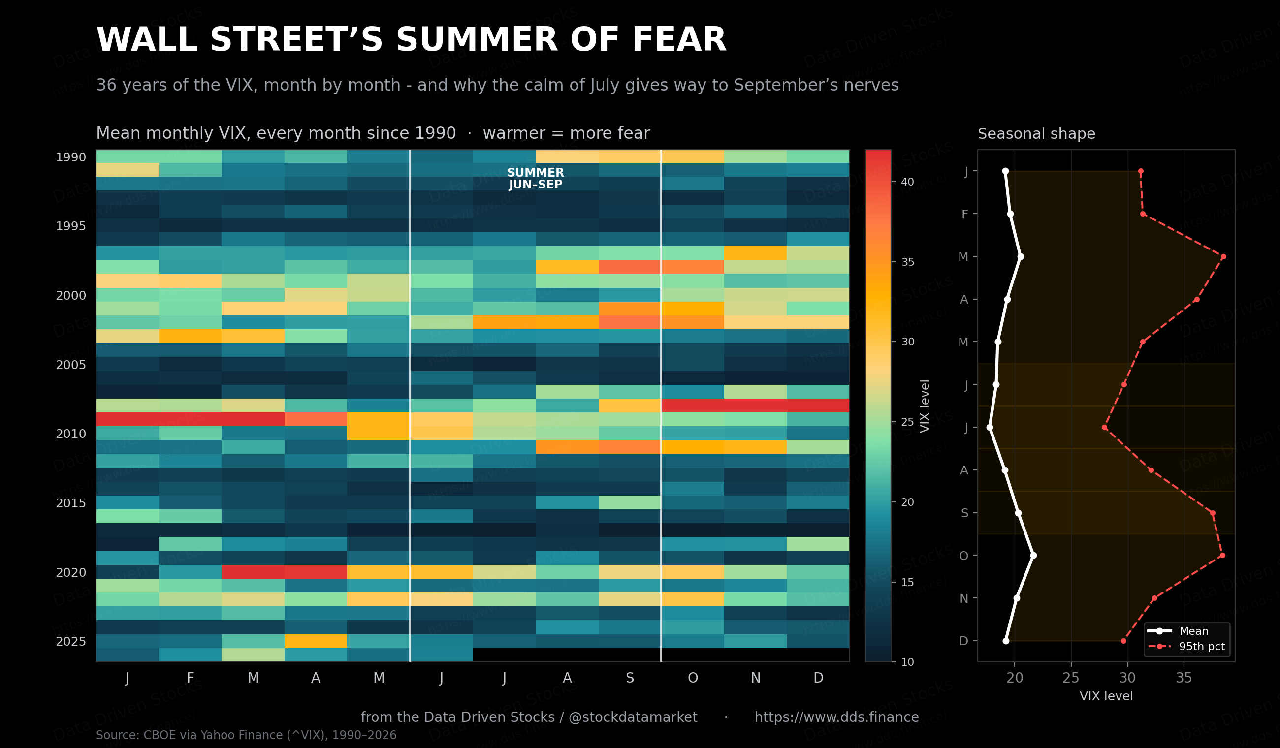
There’s a story Wall Street tells itself every year. June arrives, the trading floors thin out, the volume drains away, and everyone repeats the old line about a sleepy summer. Then somewhere between the barbecues and the back-to-school ads, the mood shifts. By the time September lands, the nerves are back. The thing is, this isn’t folklore. Run the numbers on the VIX - the market’s fear gauge - across every June through September since 1990, and the seasonal fingerprint is right there, plain as day.
The calm that isn’t quite calm
Here’s the first counterintuitive thing. Summer doesn’t start scary. June already sits a touch below the long-run average, and July is the calmest month of the four - the daily VIX has averaged 17.76 in July across the whole sample, with a typical (median) reading near 16.6. For context, the VIX has averaged 19.46 over its entire 1990-to-now history, so July really is a lull. The screens are quiet, the desks are half-empty, and complacency settles in like heat on asphalt.
But “calm on average” hides what’s going on underneath. Averages are liars when the thing you care about is the tail. And in the summer-to-autumn handoff, the tail is the entire story.
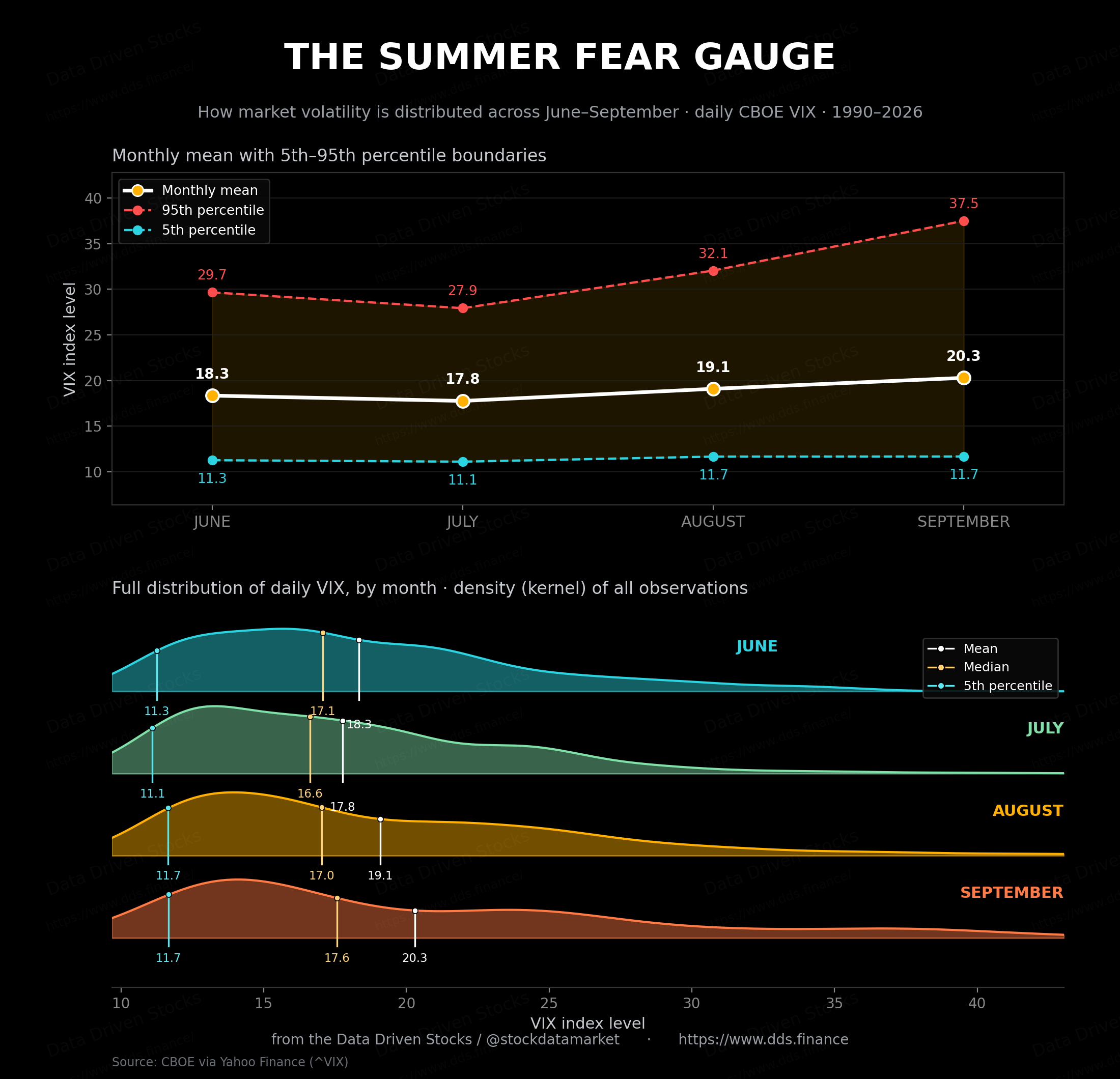
Walk it month by month. In June, the worst-case 95th-percentile VIX reading is around 29.7. July, the sleepy month, pulls that ceiling slightly lower, to roughly 27.9. So far, so boring. Then August steps in and lifts the ceiling to about 32.1. And September - September blows the doors off, pushing the 95th percentile all the way to 37.5.
Stop and sit with that for a second. The typical day in September isn’t dramatically worse than the typical day in June - the medians are within a point or two of each other. What changes is the ferocity of the bad days. September’s worst days are far worse than summer’s worst days, even though its ordinary days look almost identical. The distribution doesn’t shift so much as it stretches, and it stretches in exactly one direction: up, toward fear.
The mechanism, drawn out
If you want to see the handoff as a single moving picture, this is it - the calm mean creeping higher while the fear ceiling lifts away from it.
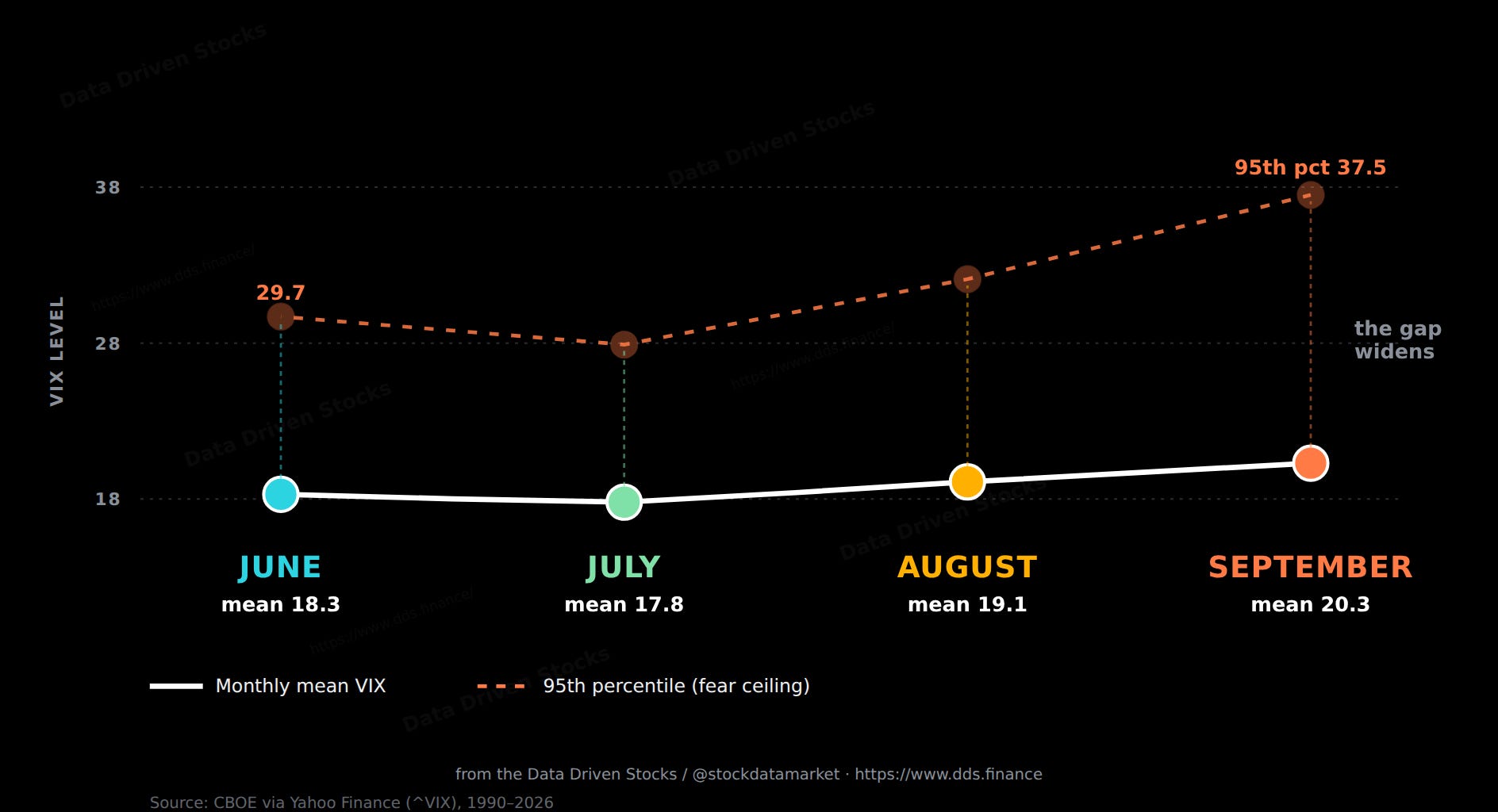
This is the part most people miss. When commentators say September is “more volatile,” they make it sound like every day is worse. It isn’t. The right way to read it is that September carries a fatter risk of a violent move. You’re not paying for a worse average. You’re paying for a longer fuse on a bigger firecracker.
And the fear refuses to leave
There’s a second dimension to all this that the spike numbers alone don’t capture: once the VIX gets elevated, how long does it take to calm back down? Volatility is famously mean-reverting - it shoots up on a scare and then drifts back toward its long-run home of about 19.5. But the speed of that drift isn’t the same in every month, and September is the outlier again.
The clean way to measure reversion speed is the half-life: starting from a day when the VIX has climbed above its mean, how many trading days does it take to close half the gap back down? Fit that to every summer observation and a sharp gap opens up. In June, July and August the half-life clusters tightly around 25 to 28 trading days - roughly five weeks to bleed off half a spike. In September it stretches to about 62 trading days, more than double. When fear arrives in September, it doesn’t just arrive bigger. It overstays its welcome.
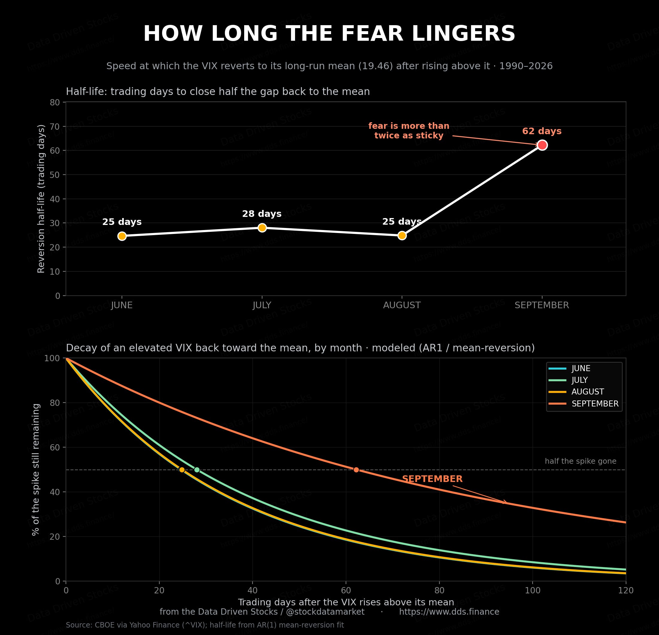
So the September picture is now three-dimensional. Its everyday volatility is barely different from June’s. But its bad days are more extreme, they happen more often, and when they hit, the elevated fear sticks around more than twice as long before fading. That combination - higher tail, fatter frequency, slower decay - is what gives the month its reputation.
Now flip the coin: what stocks actually do
The VIX measures fear about the future. But fear and outcome aren’t the same thing, so the natural next question is - does that rising September dread actually show up in returns? To answer it cleanly, we shift from the VIX to the S&P 500 itself, measured as the week-over-week percentage change. Weekly returns, grouped by the same four calendar months.
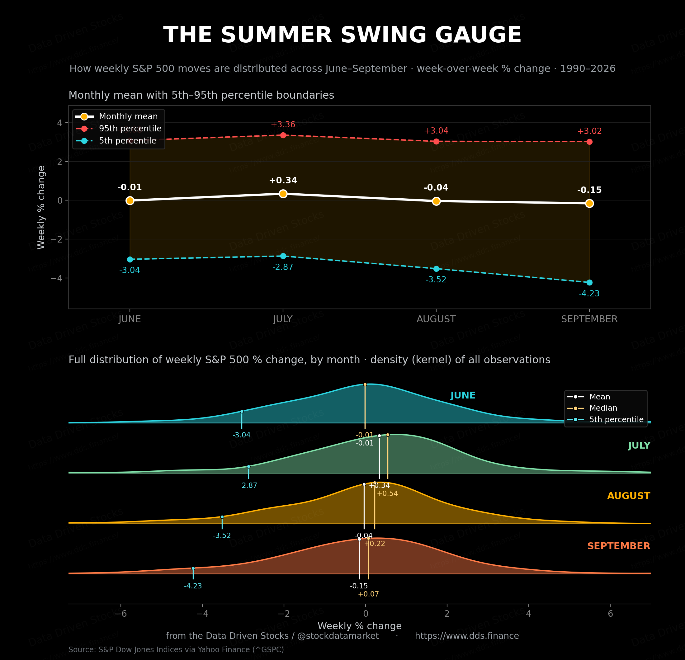
The summary stats tell a quietly revealing story. July is actually the strongest of the four months for stocks, with an average weekly gain around +0.34% and a median even higher near +0.54% - the summer rally is real. June is roughly flat. August turns mildly negative on average. And September? September posts the weakest average of the lot, around -0.15% per week, and its downside floor drops to about -4.2%, the deepest of any summer month.
There’s a subtle signature hiding in those numbers worth pointing out. In July, August, and September, the median weekly return sits above the mean. That’s the textbook fingerprint of left skew - a cluster of ordinary, slightly-positive weeks, punctuated by a handful of brutal down weeks that drag the average below the middle. It’s most pronounced in September, where the median is a faintly positive +0.07% but the average is negative. Translation: most September weeks are unremarkable, even mildly green, but the occasional gut-punch week does outsized damage. The bad weeks aren’t frequent. They’re just very, very bad.
Two tails, pointing opposite ways
Put the two gauges side by side and you get the cleanest picture of the whole season. The VIX has a fat right tail - its scary readings pile up on the high side, and that pile grows into September. The S&P’s weekly returns have a fat left tail - the brutal weeks cluster on the downside, and that cluster also deepens into September. They’re mirror images of the same underlying truth. Volatility spikes upward precisely when prices lurch downward, because that’s what fear is: the market repricing the odds of a fall.
This is also why the old “September effect” has stubbornly survived every attempt to debunk it. Look across the long histories that various researchers keep, and September consistently lands as the weakest calendar month for U.S. stocks, the only month to average a negative return across multiple multi-decade windows. The averages are modest - we’re talking fractions of a percent - but the consistency is what unnerves people. It’s not that September always falls. It’s that September has shown up negative more often than any other month, and when it falls, it can fall hard.
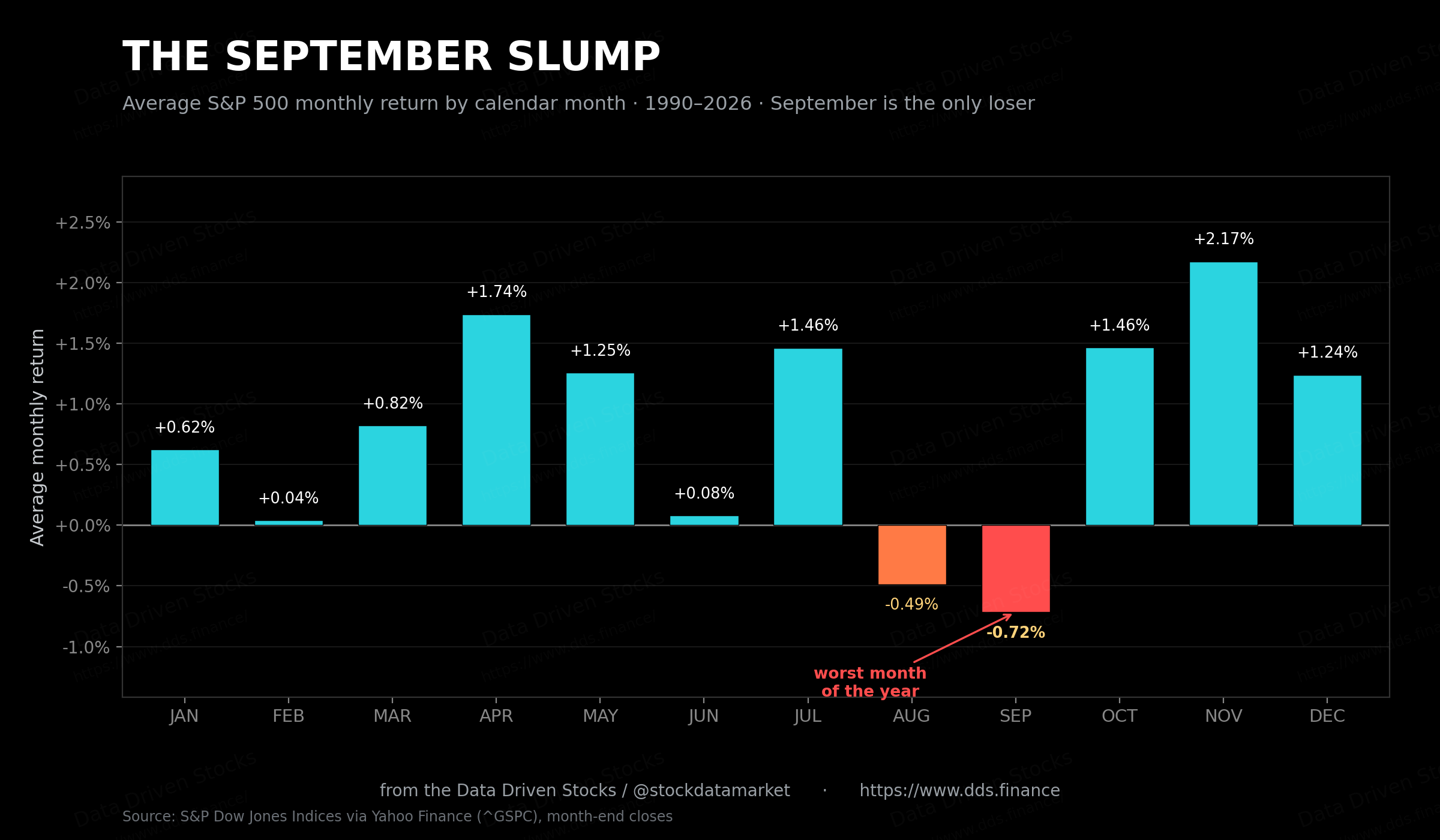
Worth keeping in perspective: my figure of around -0.7% since 1990 lines up with what the long-horizon researchers find. The numbers float a little with the start date - roughly -0.6% measured from 1950, closer to -0.8% to -1.2% over the full near-century - but the verdict never changes. September is the one month of the year that, on average, has taken money off the table.
So what do you actually do with this
Nothing, if you’re a long-term investor. That’s the honest answer and it deserves to be said plainly. But often during the summer one spot VIX options or SPX straddles very cheaply. On the other hand
Data: daily CBOE VIX and daily S&P 500 closing levels, 1990 through 12 June 2026, S&P weekly moves computed as week-over-week percentage change on Friday closes; monthly figures computed month-end to month-end. VIX record closing high of 82.69 on 16 March 2020 confirmed against CBOE, SIFMA, and Bloomberg reporting. Long-run VIX average (~19.9) per SIFMA. September seasonality and the monthly-return ranking cross-checked against LPL Research, RBC Wealth Management, StoneX, Fisher Investments, and Dow Jones Market Data historical series, all of which independently rank September as the weakest calendar month and the only one with a negative average return.
Sources: Cboe Global Markets; SIFMA Insights, “The VIX’s Wild Ride”; Bloomberg; LPL Research; RBC Wealth Management; StoneX; Fisher Investments; Dow Jones Market Data; The Motley Fool research.
Nice one! Keep them coming