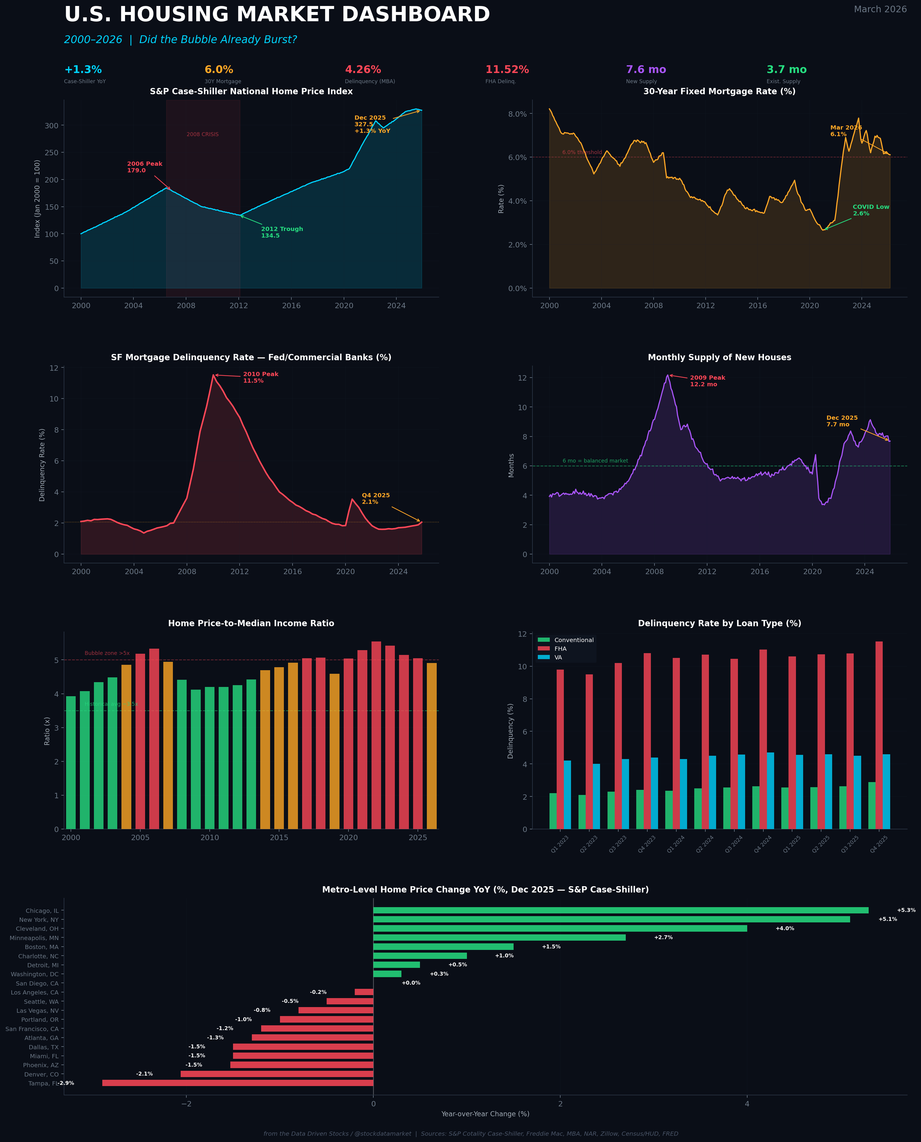
2026 — Did the U.S. Housing Market Bubble Already Burst? Are we in 2008 already or not yet ?
A dive into prices, credit stress, delinquencies, and what the numbers actually say about the state of American housing.

Everyone’s got an opinion on housing right now. Your uncle thinks it’s 2008 all over again. Your realtor says everything is fine. Twitter’s split between “biggest crash in history incoming” and “housing only goes up.” So let’s do what we always do here — ignore the vibes and look at the actual data.
The question on everyone’s mind heading into spring 2026 is simple: did the housing bubble already burst? And if not, is it about to?
The answer, as usual, is more nuanced than a headline can capture. But after pulling apart every major dataset I could get my hands on — Case-Shiller indices, MBA delinquency reports, Census housing data, Zillow metro snapshots, Fed lending surveys, and more — I can tell you this: the U.S. housing market is not crashing. Not in the way 2008 crashed. But it’s not exactly healthy, either. What we’re looking at is something more like a slow-motion pressure release. A grinding normalization that’s hitting some markets hard while barely touching others. And buried in the data, there are real stress signals that deserve attention — especially in FHA lending and lower-income borrower segments.
Let’s walk through it.
The National Picture: Cooling, Not Collapsing
Start with the headline number that everyone watches — the S&P Cotality Case-Shiller National Home Price Index. As of December 2025, the national index posted a year-over-year gain of just 1.3%. That’s the weakest annual growth in over two years, and it represents a dramatic deceleration from the double-digit gains of 2021 and early 2022.
But — and this is the key distinction — it’s still positive. National home prices, on a repeat-sales basis, have not turned negative. Cotality’s January 2026 reading confirmed the trend: national year-over-year growth slowed further to just 0.74%. The market is clearly losing momentum. Price growth went from a sprint to a jog to what now looks like a slow walk. J.P. Morgan’s securitized products research team expects national home prices to stall at roughly 0% for the full year of 2026, with rate buydowns and a modest wealth effect barely offsetting continued affordability pressure.
Meanwhile, Zillow’s typical home value measure (ZHVI) for January 2026 came in at $358,968 — essentially flat year-over-year at +0.2%, with a month-over-month decline of 0.4%. This is a market that has plateaued in nominal terms. In real, inflation-adjusted terms, American homes have actually been losing value since mid-2022, because CPI inflation has outpaced home price appreciation for several consecutive quarters.
That distinction matters enormously. If you bought a house in 2022 at the peak and your home value is flat in 2026, congratulations — you’ve lost roughly 8-10% in purchasing-power-adjusted terms. The “bubble” has been deflating quietly, in real terms, for the better part of three years. It just doesn’t show up in the scary nominal charts that dominate social media.
This Is Not 2008. Here’s Why.
I know this comparison is irresistible. And I get it — homes are expensive, rates are high, people are struggling, and the word “bubble” is being thrown around like confetti. But the structural differences between 2006-2008 and today are not subtle. They are enormous.
Caption: 2008 Subprime Crisis vs. 2026 — every major housing stress metric today sits at a fraction of the crisis-era peaks. The most dramatic difference: foreclosure starts at 0.20% vs. 1.42%, and existing home supply at 3.7 months vs. 13.0. This is not the same beast. (from the Data Driven Stocks / @stockdatamarket)
Let me walk through the comparison, because it really puts things in perspective.
In 2008, the mortgage delinquency rate for single-family homes peaked at 10.89%. Today it sits at 4.26% as of Q4 2025. That’s elevated compared to the 2023 lows of around 1.7%, but it’s less than half the crisis peak. More importantly, foreclosure starts — the actual mechanism by which distressed homes flood the market and crash prices — are sitting at 0.20%. During the crisis, they peaked at 1.42%. That’s a 7x difference. The pipeline of forced selling that drove the 2008 crash simply does not exist today.
Then there’s inventory. The existing home supply in January 2026 stands at 3.7 months. During the crisis, it ballooned to 13 months. A “balanced” market is typically defined as around 6 months of supply. We are currently sitting at barely more than half that. There just aren’t enough homes on the market for prices to collapse, even if demand weakens further.
And the most critical difference of all: lending standards. The 2008 crisis was fundamentally a credit crisis. Banks were handing out NINJA loans (no income, no job, no assets) to anyone with a pulse. Subprime mortgages represented roughly 23% of all mortgage originations at the peak. Today, subprime lending has essentially been eliminated. The Fed’s Senior Loan Officer Opinion Survey (SLOOS) from January 2026, covering Q4 2025, reported that residential mortgage lending standards were “basically unchanged” — meaning banks are not loosening credit. They’re also not dramatically tightening. Demand is what’s weaker, not credit supply.
This is a fundamentally different dynamic. In 2008, the market was flooded with leveraged, low-quality borrowers who couldn’t make payments once rates reset. Today’s borrowers, on average, have significantly better credit profiles, higher equity positions, and fixed-rate mortgages that shield them from payment shock.
Where the Stress Actually Is: The FHA Warning Signal
But here’s where the “everything is fine” narrative breaks down — and this is the part most analysts are glossing over.

The MBA’s Q4 2025 National Delinquency Survey revealed a clear bifurcation in the mortgage market. The overall delinquency rate rose to 4.26%, up 27 basis points from both the prior quarter and the prior year. But the aggregate number masks a two-speed reality.
Conventional mortgage delinquencies are at 2.89%. That’s slightly elevated but nowhere near crisis territory. These borrowers — who represent the vast majority of the mortgage market — are performing fine.
FHA delinquencies, however, jumped to 11.52%. That is the highest level since Q2 2021, when pandemic-era forbearance programs were still unwinding. The MBA specifically flagged that later-stage (90+ day) FHA delinquencies increased by 76 basis points in a single quarter, and that the FHA foreclosure inventory rate grew to its highest level since Q1 2020.
Why does this matter? FHA loans serve lower-income and first-time homebuyers — borrowers who tend to have smaller down payments, thinner financial cushions, and more sensitivity to job loss or rising costs. The MBA’s Marina Walsh noted that the Q4 results may reflect the expiration of pandemic-era FHA relief options, as well as disparities in the labor market.
The New York Fed’s Liberty Street Economics blog confirmed this pattern in a February 2026 analysis. They found that mortgage delinquency increases are overwhelmingly concentrated in lower-income zip codes, where 90+ day delinquency rates have surged from about 0.5% in 2021 to nearly 3.0% by late 2025. Higher-income borrowers remain largely insulated.
This is not a systemic credit meltdown. It is distributional stress — and it’s a warning sign that the most vulnerable segment of the housing market is under real pressure, even as the broader market holds up.
The Affordability Paradox: Ratios Still Stretched, but Improving at the Margin
One of the most commonly cited “bubble” indicators is the home price-to-median household income ratio. And on this metric, the bears have a real point.

The ratio of the median U.S. home price to median household income has spent most of the 2020s in territory that historically screams “overvalued.” At around 4.9x in 2026, it’s marginally better than the pandemic-era peak of roughly 5.5x, but it remains well above the long-run average of approximately 3.5x. On some measures that adjust for mortgage rates (the actual monthly payment burden), affordability hit historic lows in 2023-2024.
But here’s the counter-argument: affordability is actually improving, slowly. The NAR’s Housing Affordability Index rose from 102.0 in January 2025 to 116.5 in January 2026 — a meaningful improvement driven by wage growth (median incomes have been rising at a solid clip) and the year-over-year decline in mortgage rates from around 6.96% in January 2025 to approximately 6.10% in January 2026.
Freddie Mac’s 30-year fixed rate as of March 12, 2026 sits at 6.11%, up slightly from 6.00% the prior week. That’s still historically high compared to the 3% pandemic-era lows, but it represents a meaningful reduction from the 7%+ peaks of late 2023. If rates continue to drift lower — and the market is pricing in the possibility of further Fed cuts — affordability could improve further, providing a floor under demand.
The question is whether this gradual improvement is fast enough to prevent a correction. Redfin’s chief economist Daryl Fairweather has described the current environment as a “long-term housing market correction” rather than a crash, estimating that prices could return to “normal” affordability (median earner spending 30% of income on a median home) by around 2030. That’s a multi-year grind, not a sudden collapse.
The Great Metro Divergence: Where the “Burst” Already Happened
If you want to find a housing bubble that has actually burst, stop looking at the national number and zoom into specific metro areas. The story of the 2025-2026 housing market is fundamentally a story of geographic divergence.
The hero dashboard at the top of this article shows it clearly: the Midwest and Northeast are still posting solid price gains (Newark +5.6%, Chicago +5.3%, New York +5.1%, Cleveland +4.0%), while Sun Belt markets that surged during the pandemic migration boom are in outright decline.
Austin, Texas — once the hottest market in America — doesn’t even appear in the Case-Shiller 20-city index, but Zillow data shows its values have dropped roughly 5.9% year-over-year. Among the Case-Shiller tracked metros, Tampa leads the decline at -2.9%. Denver is down 2.1%. Phoenix, Dallas, and Miami are all down roughly 1.5% each. These moves may seem modest compared to 2008 double-digit collapses, but for someone who bought at the 2022 peak in any of these markets with a thin down payment, the equity erosion is real.
This geographic bifurcation makes the national “did it burst?” question somewhat misleading. If you live in Chicago, the bubble very much did not burst — your home is worth more than ever. If you live in Austin, the correction is well underway and has been for over a year.
The pattern makes economic sense. Markets that saw the biggest pandemic-era run-ups, driven by remote-work migration and speculative investor activity, are the ones correcting most aggressively now that those tailwinds have reversed. Markets with constrained supply, strong local employment, and relative affordability continue to perform.
Modeling the Near Future: Three Scenarios for 2026-2028
So where does this go from here? I’ve built out three scenario paths based on the major forecasts and the underlying data trends.

Scenario A — The Soft Landing (Base Case, ~55% probability): This is the J.P. Morgan and consensus view. National prices stall at roughly 0% in 2026 as lower ARM rates and builder buydowns provide just enough demand stimulus to offset continued affordability headwinds. Inventory rises gradually but never reaches the 6-month “balanced” threshold nationally. Mortgage rates drift toward 5.5-5.75% by late 2027 as the Fed eases further. Home price growth resumes modestly at 1-2% annually by mid-2027. This is the boring outcome — and the most likely one based on current trajectory.
Scenario B — The Hard Correction (Bear Case, ~20% probability): This scenario requires a labor market deterioration. If unemployment rises meaningfully above 5% — triggered by, say, a trade-war-induced manufacturing downturn, federal spending cuts impacting government employment hubs, or a broader economic recession — the locked-in homeowner dynamic breaks. Forced sellers emerge as job losses overwhelm the “rate lock-in” effect. National prices could decline 5-8% peak-to-trough, with Sun Belt and overbuilt markets experiencing 10-15% corrections. FHA delinquencies would spike further, potentially triggering political pressure on servicing and forbearance. This is the 2008-lite scenario — painful but not systemic, because the leverage and credit quality differences remain protective.
Scenario C — The Recovery (Bull Case, ~25% probability): This path materializes if mortgage rates drop below 5.5% faster than expected (perhaps due to a flight to safety in Treasuries or more aggressive Fed action), unlocking pent-up demand from rate-locked homeowners and sidelined first-time buyers. Cotality projects home prices rising 4.43% by January 2027 under favorable conditions. In this scenario, the 2023-2025 period looks like a brief pause in a longer-term housing appreciation cycle, and affordability gradually normalizes as wage growth compounds.
The Credit Picture: Contained, but Worth Watching
One of the strongest arguments against a 2008-style crash is the state of the credit pipeline. There’s no subprime lending engine driving unqualified borrowers into homes they can’t afford. But that doesn’t mean the credit picture is entirely clean.
Total household debt hit $18.8 trillion in Q4 2025, per the New York Fed — a $4.6 trillion increase since the end of 2019. Mortgage balances specifically grew to $13.2 trillion. Credit card debt reached $1.28 trillion, with delinquency rates elevated (though showing signs of stabilization). Auto loan delinquencies are similarly high.
The picture that emerges is one of broad consumer financial strain, particularly at the lower end of the income distribution, even as the mortgage market specifically remains on firmer footing than 2008. The risk isn’t that millions of borrowers with 800 credit scores and 20% equity default on their mortgages. The risk is that the segment of the market served by FHA and government-backed lending — the segment that enables homeownership for moderate-income Americans — continues to deteriorate, creating pockets of real distress even as the broader market muddles through.
Foreclosure filings have been rising (36,766 nationwide in October 2025, up 19% year-over-year) but remain a tiny fraction of the 3.1 million filings seen during the 2008 crash. The foreclosure pipeline is not building in a way that would create the forced-selling cascade needed for a true price collapse.
The Bottom Line: Slow Deflation, Not a Crash
Here’s what the data says, stripped of spin:
The U.S. housing market did not “burst” in the dramatic, 2008-style meaning of the word. National prices remain in positive territory, inventory is tight, lending standards are sound, and foreclosure activity is near historic lows. The structural conditions that produced the subprime crisis — reckless lending, massive leverage, a flood of supply — are simply not present in 2026.
What has happened is a multi-year real-price deflation. Inflation has quietly eroded the purchasing power of home values. Specific metro markets — particularly pandemic-era Sun Belt boomtowns — have experienced genuine nominal price corrections of 5-10%. FHA and lower-income borrowers are under increasing stress, with delinquency rates at the highest levels in nearly four years. And transaction volumes remain historically depressed, as affordability challenges and the “rate lock-in” effect keep both buyers and sellers on the sidelines.
This is not a crisis. But it’s not health either. It’s a market stuck in a slow, grinding normalization that could take years to fully resolve. The most likely path forward is one of stagnation: flat-to-modest national price growth, continued regional divergence, and a gradual improvement in affordability as incomes rise and rates (hopefully) decline.
The wildcard, as always, is the labor market. If jobs hold up, housing holds up. If unemployment rises sharply, all bets are off — and the FHA stress signal we’re seeing today could be the canary in the coal mine for a broader deterioration.
Citations
S&P Cotality (formerly CoreLogic), “Home Price Index — January 2026 Data Release,” March 2026. Via Morningstar / Business Wire.
J.P. Morgan Global Research, “The Outlook for the US Housing Market in 2026,” J.P. Morgan Insights.
National Association of REALTORS® (NAR), “Existing-Home Sales Report — January 2026,” February 12, 2026.
Mortgage Bankers Association (MBA), “National Delinquency Survey — Q4 2025,” February 12, 2026.
Freddie Mac, “Primary Mortgage Market Survey — March 5, 2026.”
U.S. Census Bureau / HUD, “New Residential Sales — December 2025,” February 2026.
U.S. Census Bureau, “New Residential Construction (Housing Starts) — 2025 Annual Summary.”
Zillow Research, “Zillow Home Value Index (ZHVI) — January 2026 Market Report.”
Federal Reserve Bank of New York, “Quarterly Report on Household Debt and Credit — Q4 2025.”
Haughwout, Lee, Mangrum, Scally, and van der Klaauw, “Where Are Mortgage Delinquencies Rising the Most?,” Liberty Street Economics, Federal Reserve Bank of New York, February 10, 2026.
Board of Governors of the Federal Reserve System, “Senior Loan Officer Opinion Survey on Bank Lending Practices — January 2026.”
Bank for International Settlements (BIS), “Selected Property Prices — Q3 2025.”
Redfin, “Is the Housing Market Going to Crash?,” March 2026.
Daryl Fairweather (Redfin Chief Economist), “Redfin’s 2026 Predictions: Welcome to The Great Housing Reset.”
Fannie Mae, National Association of REALTORS®, “Home Price Forecasts for 2026-2027.”
Federal Reserve Bank of St. Louis (FRED) — economic data series: CSUSHPINSA, MORTGAGE30US, DRSFRMACBS, MSACSR, MSPUS.


